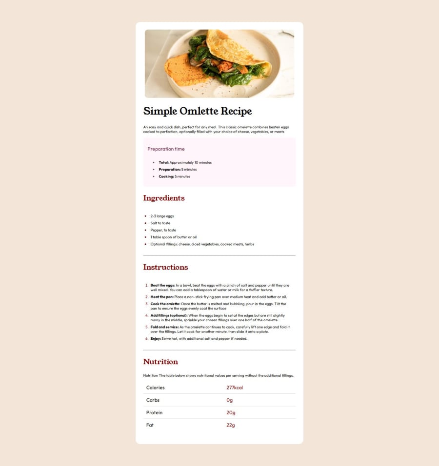
Design comparison
Solution retrospective
Very confident that i did a good job.
What challenges did you encounter, and how did you overcome them?coloring the bullets and numbers were some what a little challenge and was able to get passed it with the help of google.
What specific areas of your project would you like help with?NONE.
Community feedback
- @rodolfohgcPosted 5 months ago
You’ve done a great job so far! I have a few suggestions that might help improve your code even further:
-
Background Color: It would be beneficial to review the “style-guide.md” to ensure that the body background color matches the layout preview, as you used a darker tone.
-
Standardizing margins: I noticed that the space above and below the <hr> element varies. Standardizing these margins will create a more polished and professional appearance. You might want to check the margin settings in your CSS.
-
Responsive Design with Media Queries: Consider using media queries to make the layout responsive to different screen sizes, especially mobile devices. This is a crucial aspect of modern web development and will greatly enhance the user experience for mobile users.
Keep up the great work! These adjustments will help make your project even better.
Marked as helpful0@mamman-nafPosted 5 months ago@rodolfohgc Thank you very much very much for taking the time to review my work and guide. I will ensure to make corrections on the suggestions you made.
Very much appreciate sir.
0 -
Please log in to post a comment
Log in with GitHubJoin our Discord community
Join thousands of Frontend Mentor community members taking the challenges, sharing resources, helping each other, and chatting about all things front-end!
Join our Discord
