Design comparison
Solution retrospective
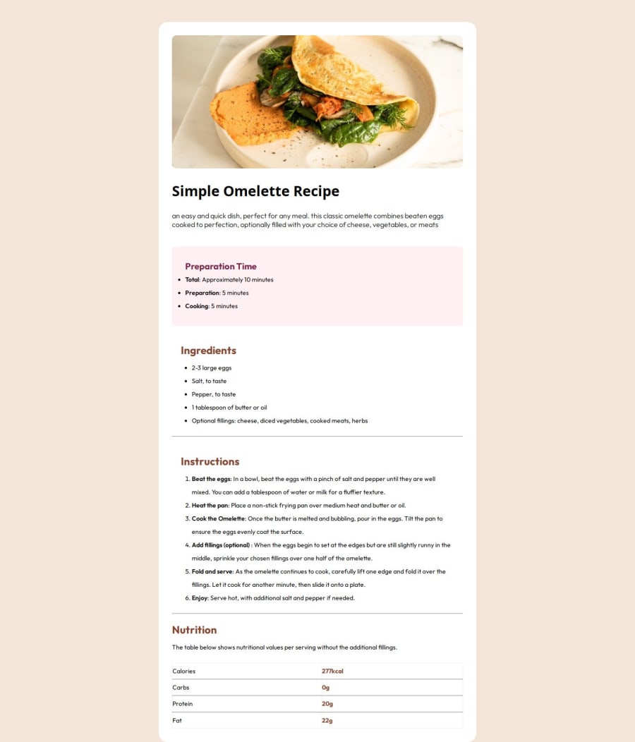
Proud of the fact that i tried to make it responsive and i loved that it worked even if not that perfect yet, the joy of getting it to work is overwhelming
What challenges did you encounter, and how did you overcome them?The challenge is that the style guide isnt that equipped with every detail needed but i think the Pro account people cant have this issue
What specific areas of your project would you like help with?I still want to keep practising and be really used to it but in a way if any one can answer, can i start learning javascript from what you have seen me done here with html and css
Community feedback
- @Papi84Posted 8 months ago
HTML & Semantic Structure:
You've done a commendable job with the HTML structure, employing semantic tags like<header>,<main>, and<footer>effectively. These tags not only improve readability but also enhance accessibility by clearly defining the roles of various content sections. There are additional opportunities to refine this further by incorporating elements like<figure>and<figcaption>for images and<section>for grouping related content.CSS & Styling:
Your CSS is well-structured and organized, making it easy to follow and maintain. The use of classes is consistent, which supports reusability throughout your stylesheets. To further improve, consider using CSS variables for common values like colors, fonts, and spacing. This would make your code more maintainable and easier to update in the future.Responsiveness & Layout:
The responsiveness of your design is well-handled, with the layout adapting smoothly across various screen sizes. However, slight adjustments to text size and line height on smaller screens could enhance readability. Testing your design in landscape mode on tablets and larger phones will help ensure consistency across all devices.Accessibility:
Your approach to accessibility is solid, particularly with descriptive alt text for images and well-structured links. To take it a step further, consider adding ARIA attributes to interactive elements and reviewing contrast ratios to ensure text is easily readable for all users, including those with visual impairments.Design Consistency:
Your design remains faithful to the original brief, with careful attention to typography, spacing, and color schemes. Any intentional deviations from the design should be documented or commented on to provide clarity on your design decisions.Marked as helpful0@ElderAdewoye23Posted 8 months ago@Papi84 Thank you so much You cant know how genuinely encouraging this feels to me I won't stop practicing💪
0
Please log in to post a comment
Log in with GitHubJoin our Discord community
Join thousands of Frontend Mentor community members taking the challenges, sharing resources, helping each other, and chatting about all things front-end!
Join our Discord
