Design comparison
SolutionDesign
Community feedback
- P@JaYS29Posted 5 months ago
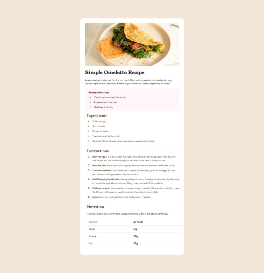
The styles of the different sections are very well applied. The main thing it should be adjusted is the size of the body. There seems to be a blank section below all the elements of the page. The other visible thing to adjust may be the size of the fonts.
0
Please log in to post a comment
Log in with GitHubJoin our Discord community
Join thousands of Frontend Mentor community members taking the challenges, sharing resources, helping each other, and chatting about all things front-end!
Join our Discord
