Design comparison
SolutionDesign
Community feedback
- @hieutran249Posted 2 months ago
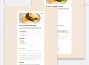
Look great to me! You can try using padding or margin to position the text or list so the UI will look better. For example the Preparation box, create a div containing the text, and use padding or margin to squeeze the div, it will look much more similar to the design.
0
Please log in to post a comment
Log in with GitHubJoin our Discord community
Join thousands of Frontend Mentor community members taking the challenges, sharing resources, helping each other, and chatting about all things front-end!
Join our Discord
