

Design comparison

Solution retrospective
Key Achievements:
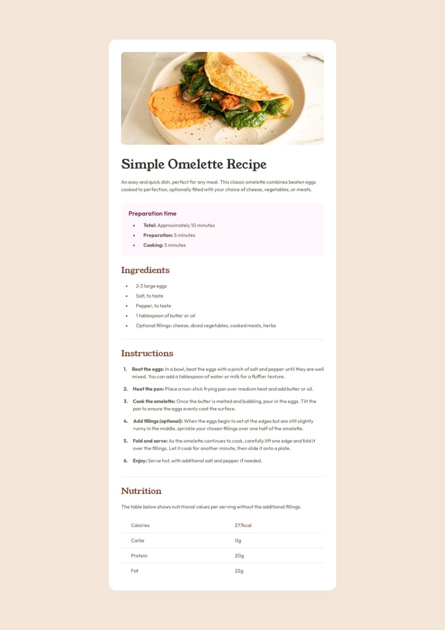
I am particularly proud of positioning the lists. In the project, there is an issue with the space between the number and the dot, which is quite tricky to handle in CSS. Thanks to AI and Google, I was able to solve this problem effectively.
Another success is the responsiveness of the project. The page adjusts smoothly to different screen widths, which was a significant challenge for me.
I am also proud of styling the table, as it was my first time working with such an element. With the help of AI and Google, I managed to achieve the desired result.
Future Plans:
Next time, I will know how to position the lists more quickly, which will save me time on similar projects.
What challenges did you encounter, and how did you overcome them?Challenges I Encountered:
The biggest challenge was positioning the lists, as there was a margin between the text and the numbering in the project. After several attempts and thorough research, I managed to resolve this issue.
Another difficult task was creating and styling the table. It was my first time doing this, but again, with the help of AI and Google, I was able to overcome this challenge.
What specific areas of your project would you like help with?Please Check:
- List Styling: Was it done correctly? Can it be done faster and more efficiently?
- Responsiveness: Is the page fully responsive?
- Overall Grammar, Readability, and Code Understanding: Is the code easy to understand and well-written?
Community feedback
Please log in to post a comment
Log in with GitHubJoin our Discord community
Join thousands of Frontend Mentor community members taking the challenges, sharing resources, helping each other, and chatting about all things front-end!
Join our Discord