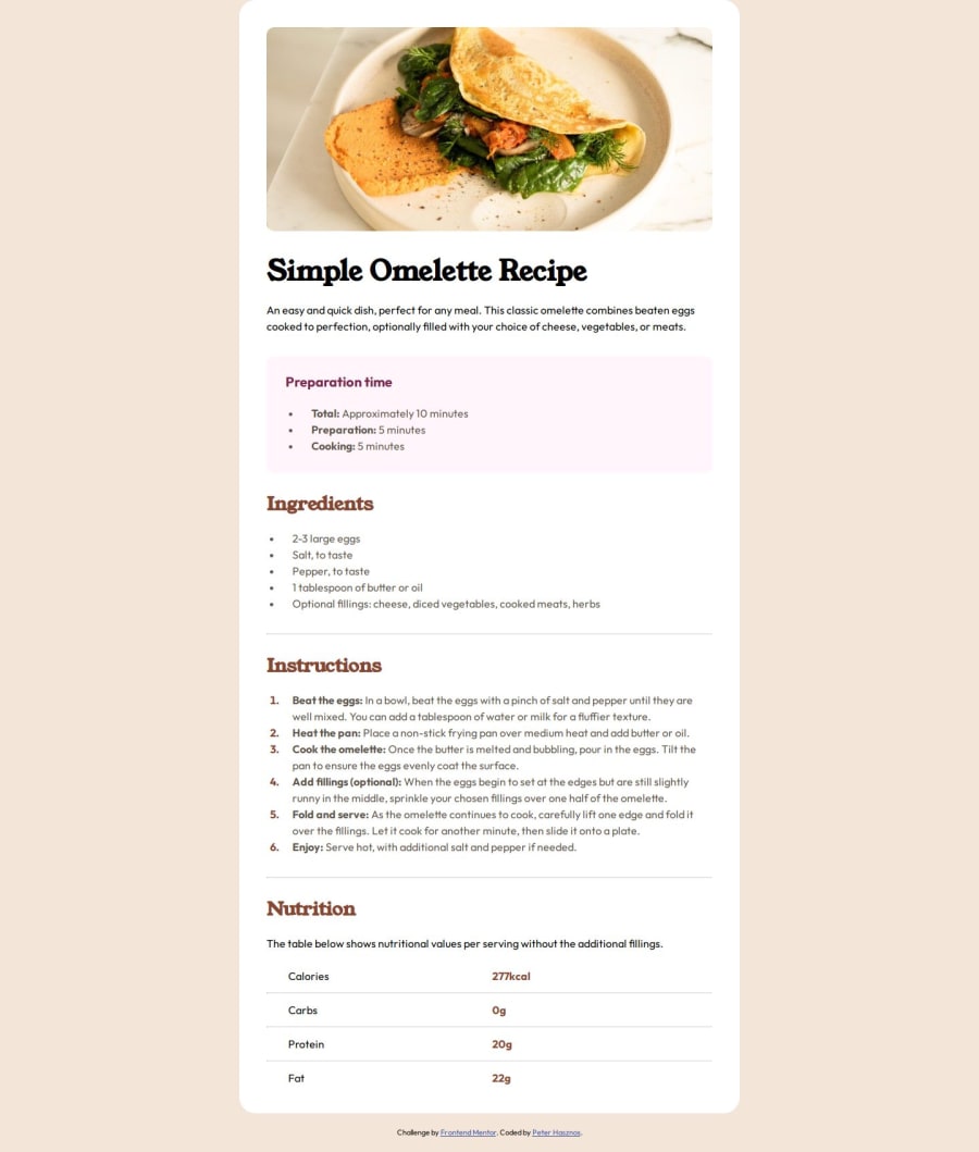
Recipe page using Flexbox, Media queries, CSS Custom Props
Design comparison
Solution retrospective
- I am getting better at using Flexbox.
- I used Flexbox's gap property instead of margin and I find it more convenient.
-
Moving list items were little bit tricky for me, because I couldn't decide which way the correct way to do that. So I modified the default padding on the parent (ul, ol) elements and after that I use padding-left on the list items.
-
I can't center my article component with flexbox, I guess the container or the viewport is not big enough. Any idea to solve that? Or should I use the absolute position trick?
-
Sometimes it takes more time for me to decide which is the correct way to do something, but I know there are more correct solutions, and it depends on the task.
- Decide which method I should use to solve a task faster.
I gladly receive any opinion where can I improve myself based on my solution.
Thank you for your review in advance. :)
Community feedback
- @DylandeBruijnPosted 4 months ago
Hiya @peter-hasznos,
Congratulations on a great looking solution! Glad to hear that you are getting better at Flexbox, it's a great layout tool in a front-end developer's arsenal. I agree with you that
gap
can be more convenient instead ofmargin
. Keep in mind though that every property has an use case and sometimes it can be better to usemargin
.I styled my lists using the the same way as you did and according to the internet it is common practice. It still feels a bit weird though to do it that way.
I would be happy to help with the centering of your
article
component, could you describe your problem in more detail?As the saying goes, all roads lead to Rome. And it looks like you found a solution working for you and that's what matters! If your code does what it needs to and your project looks like you want to then you achieved your goal in my opinion.
Which task would you like to solve faster? I could give you feedback on the methods used.
A bit of friendly constructive feedback:
-
You don't need a
div
around yourimg
perse. You could put the same styling on theimg
itself. -
You could try adding some
padding-block
(shorthand for padding-top and padding-bottom) on yourbody
tag so it's more inline with the design.
I hope you find my feedback helpful, I would appreciate it greatly if you could mark it as helpful if it did.
Marked as helpful2@peter-hasznosPosted 4 months agoHey @DylandeBruijn,
Sorry for the late reply.
I really appreciate your long feedback.
Yes I also think that every property has an use case. I really like the gap property now.
I have tried to center the article with flexbox justify content and align items, but I think the article is too big, so it can't make a gap at the bottom and at the top. What do u think the problem is?
I would like to solve the projects faster, but I think I just need to solve more projects and eventually I will be faster with more experience.
I will try those suggestions of yours.
Your feedback was really helpful. How often do u make side projects like these ? :)
1@DylandeBruijnPosted 4 months agoHiya @peter-hasznos,
No problem! You are right that the article is too big, and I think in this case you want the recipe page aligned to the top of the page actually so users don't have to scroll down and can start reading right away. It's different from the previous projects like the qr card and blog card because need to be centered in the middle as is. But in a real world scenario they would probably be displayed in a grid for example. You could put some
padding-block
(shorthand forpadding-top
andpadding-bottom
) on yourbody
element to give the recipe some spacing.Solving projects faster definitely comes with more experience. And as you finish more projects and try more tools you'll figure out what works for you and your workflow.
I'm glad I could help you out! I try to do one side project a day, it depends how busy I am and how big the project is.
0 -
Please log in to post a comment
Log in with GitHubJoin our Discord community
Join thousands of Frontend Mentor community members taking the challenges, sharing resources, helping each other, and chatting about all things front-end!
Join our Discord