Submitted about 1 year agoA solution to the Recipe page challenge
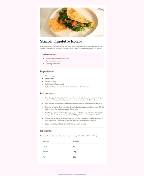
Recipe Page using Flexbox, Grid and Media Queries
@KhutsoJ

Solution retrospective
What are you most proud of, and what would you do differently next time?
I'm most proud of the responsive design I implemented for mobile screens as well as regular screens.
What specific areas of your project would you like help with?Making the project more responsive and reducing the class tags (maybe by simplifying them using general markup / CSS styles for certain elements).
Code
Loading...
Please log in to post a comment
Log in with GitHubCommunity feedback
No feedback yet. Be the first to give feedback on KhutsoJ's solution.
Join our Discord community
Join thousands of Frontend Mentor community members taking the challenges, sharing resources, helping each other, and chatting about all things front-end!
Join our Discord