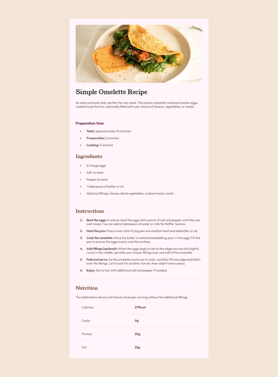
Design comparison
SolutionDesign
Solution retrospective
Please tell me if i did anything wrong guys tks so much ^^!
Community feedback
- @alphastand27Posted 10 months ago
Hey @alemdaphelan, hope you are doing fine. Your solution is really good and has helped me on revising some html tags and some css.
Here are some tips below that might make it better
Instead of the div tag for the container I believe the section tag or main tag will be a better option for semantic HTML and for you container try changing the background to background-color, that might help set the color and not the pink color it is currently showing.
Overall nice work, keep on the good work.
1
Please log in to post a comment
Log in with GitHubJoin our Discord community
Join thousands of Frontend Mentor community members taking the challenges, sharing resources, helping each other, and chatting about all things front-end!
Join our Discord
