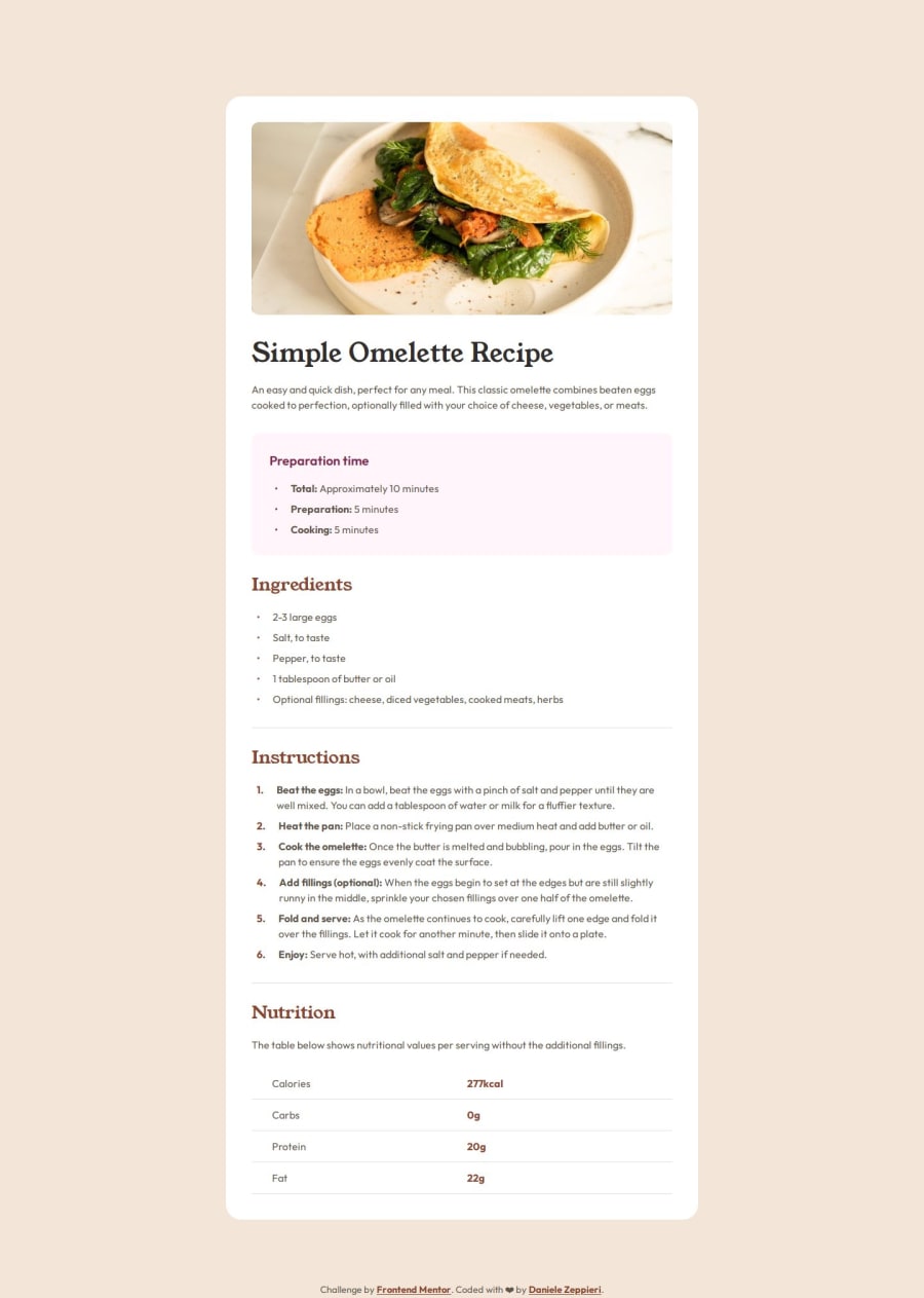
Recipe Page using custom marker, flex, grid, counter(), variables, BEM
Design comparison
Solution retrospective
With this challenge, I discovered a lot of new things. One thing that makes me most proud is how ::marker pseudo-elements work and why we need a custom marker to achieve the design specs, so solving that made me happy. One thing I'll probably do differently next time is how I create variables for spacing, margin, gap etc etc.
The tricky challenge for me was to create the right style for making `` look like design specs.
What specific areas of your project would you like help with?I would like to receive feedback on how I made the li to make it as close as possible to the design.
Thanks a million.
Please log in to post a comment
Log in with GitHubCommunity feedback
- @IvanFdez01
About the
lielements... Maybe what's left in your page is applyingpadding-lefton yourlielements, that will separate the dots from each text. I've also appliedmargin-bottomto give the Preparation time and Ingredients list inter-linear height (similiar to the function line-height on paragraphs p). Hope this helps you.
Join our Discord community
Join thousands of Frontend Mentor community members taking the challenges, sharing resources, helping each other, and chatting about all things front-end!
Join our Discord
