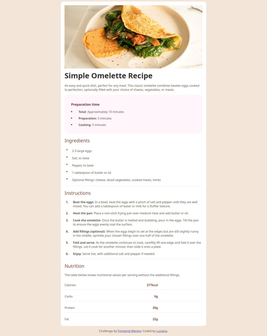
Design comparison
Solution retrospective
I'm proud of the styles, the divisions and some organizing techniques. I will do different next time on the styles, it's too big and a bit confusing.
What challenges did you encounter, and how did you overcome them?The challenges i faced up was the CSS (in paddings, widths, margins and aligns), i had to ask to GPT how to do some things and saw how to do some codes at free code camp.
What specific areas of your project would you like help with?CSS padding, widths, heights and margins on lists, images and organizing the texts, so it looks better and less strange.
Community feedback
- @adrian-reina-391Posted 8 months ago
you should add margin top and bottom in the desktop view, but the list were perfect i had it similar but i canged ir because I didnt get any way of getting the bullets in one color an the text in other, now i see it so simple, i used spans for bullets and tables to position it, but your way is better, even when i am missing something , how you could make that the numbers in the ordered list, stayed in the top of their spaces , in my it goes to the middle
Marked as helpful1@CodeCraziness92Posted 8 months agoThanks for the feedback! I don't think the list is perfect, because on mobile it looks strange, btw, the list isn't at 100% the width's device, i forgot to put it 100% of the width's device. And i recomend you to ask some things in Chat GPT but never ctrl+c and ctrl+v, this shouldn't help you to learn how to make something or anything else. @adrian-reina-391
0
Please log in to post a comment
Log in with GitHubJoin our Discord community
Join thousands of Frontend Mentor community members taking the challenges, sharing resources, helping each other, and chatting about all things front-end!
Join our Discord
