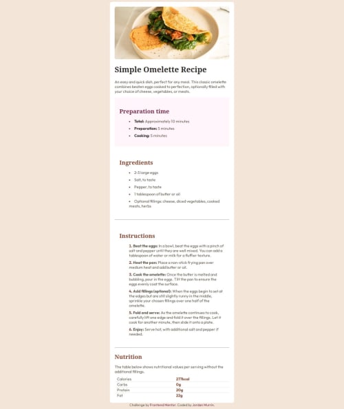
Recipe Page using CSS nesting

Solution retrospective
Most proud of the CSS nesting and learning more about styling list markers. Next time will try prototyping in Bootstrap for a quicker start.
What challenges did you encounter, and how did you overcome them?I had a hard time analysing the jpg because the color palette put a real strain on my eyes. I had a hard time figuring out what was going on, and what is up with 3 shades of white? I was finally able to begin by looking over over people's work and seeing how they interpreted the styles.
What specific areas of your project would you like help with?The media query is very messy and would like some help cleaning up the styles. Perhaps I need to fix something in the html?
Please log in to post a comment
Log in with GitHubCommunity feedback
No feedback yet. Be the first to give feedback on beowulf1958's solution.
Join our Discord community
Join thousands of Frontend Mentor community members taking the challenges, sharing resources, helping each other, and chatting about all things front-end!
Join our Discord