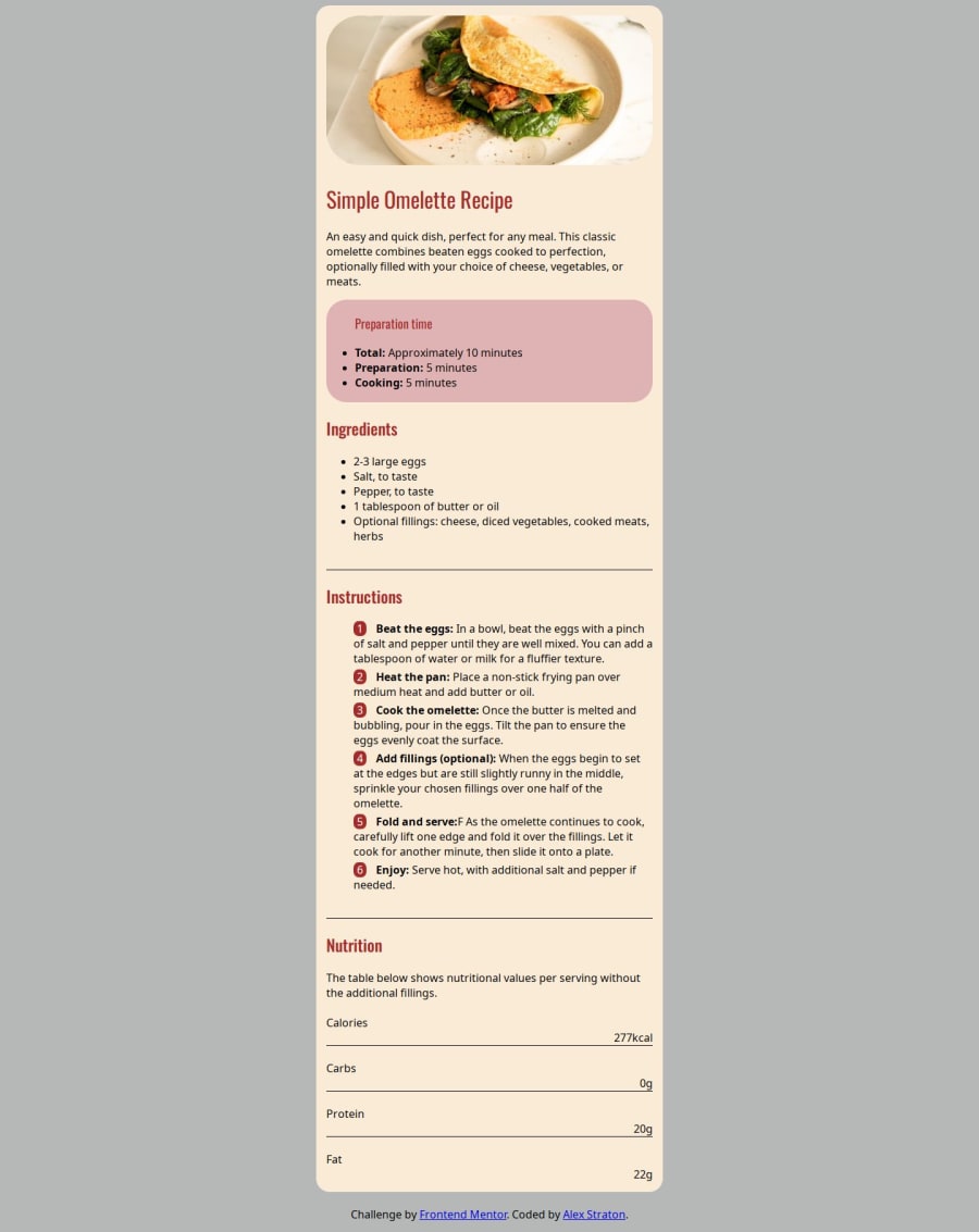
Recipe page using CSS, HTML and responsive design
Design comparison
Solution retrospective
I am proud of making the image responsive and using the media query (I did follow a Youtube tutorial which told me how).
What challenges did you encounter, and how did you overcome them?I was not able to make the list numbers move over to the left, I didn't know how to style just the numbers.
What specific areas of your project would you like help with?I would like feedback on responsive design. I used the dev tools and saw that on some mobile devices a bit of the right side is cut out, I don't know why or how to fix it.
Community feedback
- @AshongAbdallah06Posted about 1 year ago
I don't think there's a problem with the responsiveness. The items start to overflow when the screen is 120 pixels or less. Realistically, there's no screen size less than 200, I might say. But you can improve on making it look similar to the original by using the styles provided in the README.md and just testing them out.
Marked as helpful1@AlexStratonPosted about 1 year ago@AshongAbdallah06 Thanks so much! Really appreciate the feedback. Ok I will read the styles section more closely next time. Can I personalise the website with my own images for examples or my own text, or am I supposed to use the text and images I am given?
I wanted to know what this means: All page content should be contained by landmarks
Thank you for pointing out the list error.
0@AshongAbdallah06Posted about 1 year ago@AlexStraton You could personalize the website. But I would advise you to rather create a copy of the code and personalize it as you want. But there are some projects where you should use your details, like any projects that involve putting in links to GitHub, etc.
All page content should be contained by landmarks, meaning your code needs to be inside sematic elements like the
header,main,section, andfooter. Wrap the whole thing in amaintag. For each new topic, like ingredients, nutrition, etc., wrap it in asection.Put the
omeletteimage inside aheaderand take it out of themain. Change<div class="attributtion">to a<footer class="attributtion">and let it be outside the main. After this, the styles will be messed up, and you will need to fix them in the CSS.So the final code should look something like this:
<body>
    <header>Omelette Image<header>
    <main>
        // Everything else should be inside the main
        <section>Ingredients Section</section>
        <section>Nutrition Section</section>
        ..............................
    </main>
    <footer class="attribution">
        This is the footer
    </footer>
<body>
I hope you find this helpful.
Marked as helpful0@AlexStratonPosted about 1 year ago@AshongAbdallah06 Thank you, yes, extremely helpful.
0
Please log in to post a comment
Log in with GitHubJoin our Discord community
Join thousands of Frontend Mentor community members taking the challenges, sharing resources, helping each other, and chatting about all things front-end!
Join our Discord
