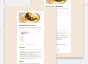
Design comparison
Community feedback
- @bedendePosted about 2 months ago
Areas for Improvement Use of Colors:
Using HSL for colors is great for manipulation. However, ensure your color choices provide sufficient contrast for readability, especially in light backgrounds. Avoid Fixed Widths:
Instead of max-width: 40rem; for the main container, consider using relative units like percentages for better adaptability to various screen sizes. List Items:
The <li> elements are well done, but you could consider using <ol> for ordered instructions to enhance structure. Table Structure:
In your nutritional values section, consider using a <table> element for clarity and semantic correctness instead of <div class="tab">. Font Weight Variations:
In the h1, h2 styles, using font-weight: 400 is fine, but you might want to consider using a heavier weight for more impact, especially for headers. CSS Organization:
Consider grouping related styles together for better readability (e.g., all font-related styles in one section). Avoiding Inline Styles:
Although you haven't used inline styles, be mindful in general. Keeping styles in your CSS file improves maintainability. Accessibility Considerations:
Ensure that all images have meaningful alt text for screen readers. For decorative images, use empty alt attributes.
Marked as helpful1
Please log in to post a comment
Log in with GitHubJoin our Discord community
Join thousands of Frontend Mentor community members taking the challenges, sharing resources, helping each other, and chatting about all things front-end!
Join our Discord
