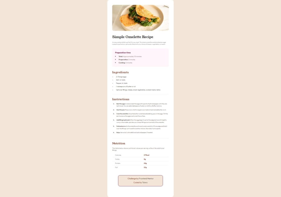
Recipe Page using CSS Flexbox


Design comparison

Solution retrospective
-
Responsive Design: I ensured that the layout adapts well to different screen sizes. The use of a media query to adjust the design for smaller devices (375px) is well executed.
-
Typography: The integration of custom fonts like "Outfit" and "Young Serif" gives the page a unique look and feel.
-
Semantic HTML: I used semantic tags (, , , , etc.) to improve accessibility and readability, both for users and search engines.
-
CSS Structure: I maintained a consistent style throughout the CSS, making it easier to read and maintain.
-
Font Integration: One common challenge is integrating custom fonts correctly. Ensuring that the font files load properly and display as intended can sometimes be tricky.
-
Responsive Design Adjustments: Making sure that the layout looked good on both large and small screens required some fine-tuning, especially when dealing with font sizes and padding/margins for different devices.
-
Styling Consistency: Ensuring that all sections (like ingredients, instructions, and nutrition tables) maintain consistent styling took some effort, especially when aligning text and ensuring proper spacing.
-
Accessibility: Adding aria-label attributes where necessary, and ensuring color contrast is sufficient for visually impaired users. For example, the light shades of grey used for text might not have enough contrast for readability.
-
HTML & CSS Best Practices: Using more descriptive class names for better readability. Leveraging flexbox or grid more extensively to simplify the layout.
-
Performance Optimization: The current implementation loads several custom font files. It might be helpful to explore methods to optimize font loading, like using the font-display property or reducing the number of font weights to speed up load times.
-
CSS Organization: Moving towards a more modular approach, like using utility-first frameworks (Tailwind CSS) or organizing my styles into partial files (if using a preprocessor like SCSS), could make the project easier to maintain.
Community feedback
- P@lia-oliveiraPosted 5 months ago
Hey, @Tainicknack0505! From your description, it seems like you tried to observe every detail. Congratulations on your effort! I found it cool that you used the <strong> tag for the highlighted words. When I refactor my project, I’ll use it too. Your stylesheet is really well-organized and easy to read. I’d like to suggest something for when you refactor your project. Use relative units like
emorrem, including for fonts. Currently, if a user needs to zoom in on the browser to read the website, they won’t be able to. Try starting your project with a mobile-first approach. You’ll need fewer media queries to adapt your project. Keep going!Marked as helpful1

Please log in to post a comment
Log in with GitHub
Join our Discord community
Join thousands of Frontend Mentor community members taking the challenges, sharing resources, helping each other, and chatting about all things front-end!
Join our Discord