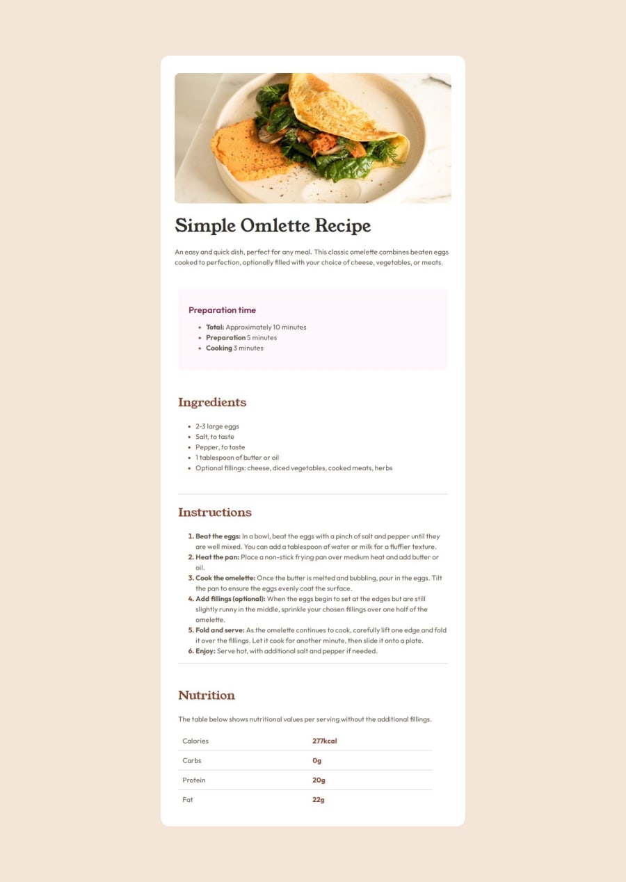
Design comparison
SolutionDesign
Solution retrospective
What are you most proud of, and what would you do differently next time?
The fact that the second time around I was able to go back in and fix the mistakes without much reference to outside sources.
What challenges did you encounter, and how did you overcome them?I really struggled with the padding and margins, and also creating borders between divs. Understanding how to use figma was useful in overcoming these issues.
What specific areas of your project would you like help with?I would like to know if my solution is responsive, will it work on mobile for example?
Are my margins and padding correct now?
Community feedback
Please log in to post a comment
Log in with GitHubJoin our Discord community
Join thousands of Frontend Mentor community members taking the challenges, sharing resources, helping each other, and chatting about all things front-end!
Join our Discord
