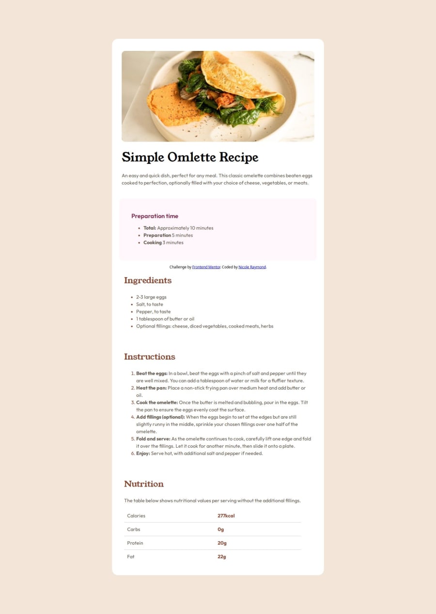
Design comparison
Solution retrospective
Im proud of the fact that in this project I really got to grips with how figma works.
In future, I would plan out all of my padding, margins and how I would align all the divs I'm using before getting to work. This way it won't be so confusing when returning to the project after stepping away.
What challenges did you encounter, and how did you overcome them?I struggled to access the fonts and apply different text styling to the same at the same time.
To overcome this I sought out tutorials on how to use @font-face and ::market element which solved these problems quickly.
What specific areas of your project would you like help with?I am unsure about the way I've used flexbox to align all of my content, I feel like the end product looks correct but I don't know if my method was. Is there an easier way to achieve the same result?
Are my padding and margins correct?
Community feedback
Please log in to post a comment
Log in with GitHubJoin our Discord community
Join thousands of Frontend Mentor community members taking the challenges, sharing resources, helping each other, and chatting about all things front-end!
Join our Discord
