Design comparison
SolutionDesign
Solution retrospective
What are you most proud of, and what would you do differently next time?
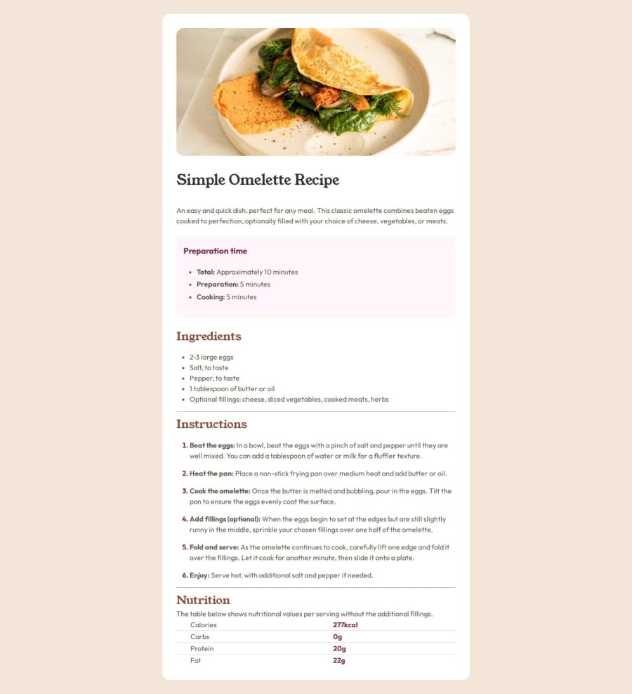
I think the BEM naming I used it's pretty good so but still not perfect. From the design It looks pretty similar for me :D
What challenges did you encounter, and how did you overcome them?I had troubles with the Nutrition table at the end, I've always have problems with tables. Also when I tried to change tha mark of the list items.
What specific areas of your project would you like help with?Everything you can :)
Community feedback
- @MiloosN5Posted about 2 months ago
What issues are you encountering with tables and markers? The main problem I notice is with paddings/margins and possibly some sizes. For example, the main title seems smaller in your solution —at least based on a comparison with the solution design.
0
Please log in to post a comment
Log in with GitHubJoin our Discord community
Join thousands of Frontend Mentor community members taking the challenges, sharing resources, helping each other, and chatting about all things front-end!
Join our Discord
