Solution retrospective
What are you most proud of, and what would you do differently next time?
Using Pseudo-Element Selectors
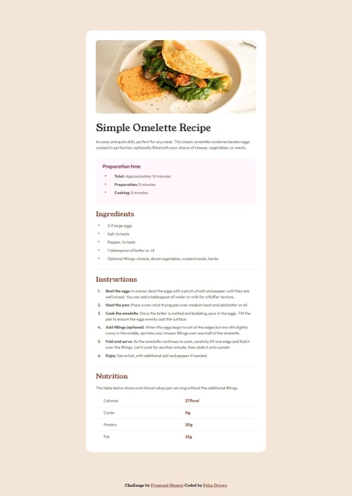
Custom Bullets with::before
/* Custom bullets using ::before */
.preparation-time-list li::before,
.ingredients-list li::before {
  content: '•'; /* Unicode bullet character */
  color: var(--Nutmeg);
  position: absolute;
  left: 0.5rem;
  font-size: 1.5rem;
  line-height: 90%;
}
Explanation: Adds custom bullets to list items.
Using Child Selectors
Highlighting the Last Child of Table Cells.nutrition-table td:last-child {
color: var(--Brandy-Red, #854632);
font-weight: 700;
}
Explanation: Styles the last cell in each row of a nutrition table.
Resetting Default Styles
Next time I´ll go back to a simple reset for all(*). Tried only on body, but made things more difficult.body {
margin: 0;
padding: 0;
box-sizing: border-box;
}
Explanation: Resets margin and padding for the body element.
Recommended Reset for All Elements* {
margin: 0;
padding: 0;
box-sizing: border-box;
}
Explanation: Resets margin and padding for all elements.
What challenges did you encounter, and how did you overcome them?I think styling the lists and a table was a nice challenge and I learned something along the way of trying different solutions.
What specific areas of your project would you like help with?Always open for suggestions. Maybe check out semantic and landmarks in HTML, but I think a "main" and "section" make sense.
Code
Loading...
Please log in to post a comment
Log in with GitHubCommunity feedback
No feedback yet. Be the first to give feedback on Felix Drawe's solution.
Join our Discord community
Join thousands of Frontend Mentor community members taking the challenges, sharing resources, helping each other, and chatting about all things front-end!
Join our Discord