Not Found
Not Found
Not Found
Not Found
Not Found
Not Found
Not Found
Not Found
Not Found
Not Found
Not Found
Not Found
Not Found
Not Found
Not Found
Not Found
Not Found
Not Found
Not Found
Not Found

Submitted

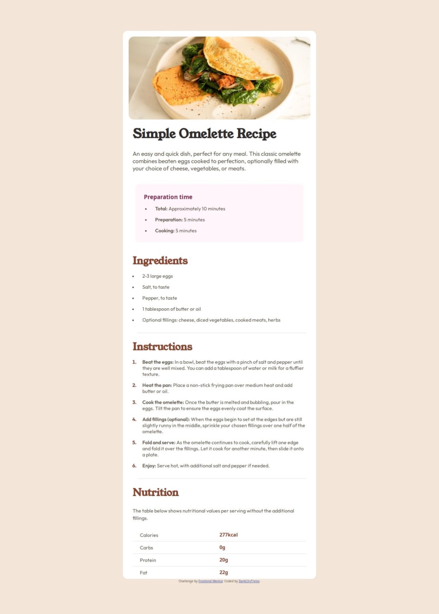
Recipe page. Tried to mobile-first for the very first time.

@DarkCityTreno

Desktop design screenshot for the Recipe page coding challenge

This is a solution for...

  • HTML
  • CSS
1newbie
View challenge

Design comparison


SolutionDesign

Solution retrospective


What are you most proud of, and what would you do differently next time?

"Proud" is a strong word but tried mobile-first approach for the very first time.

What specific areas of your project would you like help with?

All areas lol. I truly feel sorry for whoever will try to read through my god-awful code. I hope I'll get better with more practice/experience.

Community feedback

@DylandeBruijn

Posted

@DarkCityTreno

Hiya again! 👋

Great job finishing this project and try not to be too hard on yourself! Glad to hear you were willing to try the mobile first approach, how did it compare to desktop first? You are making a lot of progress, keep on practicing!

Things I like about your solution 🎉

  • Responsive
  • Use of semantic HTML elements
  • Clear descriptive CSS classes
  • Use of CSS custom properties
  • Use of relative CSS units like rem

Good stuff!

Things you could improve ✍️

  • I recommend not using percentages for padding. It does have it's use cases, but in work I rarely use it. Most of the time I use em or rem.

  • Try centering your <main> by making your <body> a Flex parent. By making the <body> a Flex parent the <main> becomes a Flex child and is able to be centered within the Flex parent. Remember to give your <main> a max-width as well. Read more about centering with Flexbox here.

  • Be careful with using viewport units for things like border-radius. 1vw equals 1% of the viewport width, so when the width of the viewport (your browser window) gets smaller this value get's smaller as well. This causes your border-radius to change when the viewport get's smaller and larger, which you don't want in this case. That's why it's common to use pixels or percentages for border-radius so the border-radius stays the same whatever the viewport is. You would use percentages like 50% to make an image a circle for example, like in the social links project.

  • I suggest removing things like margin: 1rem auto; on your .preparation-time element. You want the element to take up the full width of it's parent, which is the recipe card in this case. The margin causes the element to always be centered inside the card.

  • I see you even experimented with grid for the table, well done! It's a very useful layout tool like Flexbox. You could try achieving the same result using the <table>, <td> and <tr> elements if you like so it's really like a table.

You definitely did better than you think! And your code is not hard to read in my opinion. Happy to see your progress!

I hope you find my feedback valuable, and I would appreciate it greatly if you could mark my comment as helpful if it was! 🌟

Let me know if you have more questions and I'll do my best to answer them. 🙋‍♂️

Happy coding! 😎

Marked as helpful

1

@DarkCityTreno

Posted

Heeey @DylandeBruijn As per usual thank you for your feedback, I really really appreciate it and it's very helpful. Something went wrong with border-radius in my case, no matter what unit I've tried was either working well on desktop, or in mobile, but not both, only vs has worked, now that I'm thinking about it, maybe I just should've added more @media code specifically for this case. Anyways once again thank you so much for you help!

1

@DylandeBruijn

Posted

@DarkCityTreno

I see what you mean, this is a quirk with border-radius, I actually ran into the same problem recently! If you have a parent (card in this example) and a child (the image in this example) both with the same border-radius they will still look different from each other as you might have noticed. This is because to get the same border-radius for both you need to do some calculations for the inner `border-radius. You can read more about it here. Or if you prefer a video. I recommend watching more videos of Kevin Powell by the way. He produces some great CSS content which will definitely help you!

Marked as helpful

1

@DarkCityTreno

Posted

Thank you friend @DylandeBruijn I'm watching videos of Kevin everyday, he's one of a kind for sure ^_^

1
Leo M. 70

@theNomadicEnby

Posted

N/A -- great work!

1

Please log in to post a comment

Log in with GitHub
Discord logo

Join our Discord community

Join thousands of Frontend Mentor community members taking the challenges, sharing resources, helping each other, and chatting about all things front-end!

Join our Discord