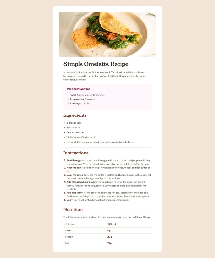
Design comparison
Solution retrospective
I got a better understanding of spacing between elements in the challenge. I will use grid layout next time.
What challenges did you encounter, and how did you overcome them?Positioning better my elements. Understanding how use padding and margins better.
What specific areas of your project would you like help with?I want to get even a better understanding of positioning and spacing my elements and improve my understanding of responsiveness in my projects.
Community feedback
- @fr4nbttPosted about 2 months ago
Solution looks great. Here my 2 cents:
Header Hierarchy: Consider using <h2> for "Preparation time" instead of <h3>, as it should follow the main title hierarchy. The same applies to the "Instructions" and "Nutrition" sections — they should be <h2> instead of <h1>.
Semantic HTML: The first <header> tag is somewhat redundant. You may want to combine the two header sections into a single <header> element for clarity.
Image Alt Text: The alt text for the header image could be more descriptive. Instead of "omelette-image," consider something like "A golden-brown omelette garnished with herbs."
List Structure: For the preparation list, consider using <strong> instead of <b> for better semantic meaning.
ARIA Labels: Consider adding ARIA labels or roles where appropriate to enhance accessibility.
Best of luck! Keep up the great work.
Saludos desde Argentina.
Marked as helpful1@gianmromeroPosted about 2 months ago@fr4nbtt Gracias por el feedback hermano. Lo tomare en cuenta.
1
Please log in to post a comment
Log in with GitHubJoin our Discord community
Join thousands of Frontend Mentor community members taking the challenges, sharing resources, helping each other, and chatting about all things front-end!
Join our Discord
