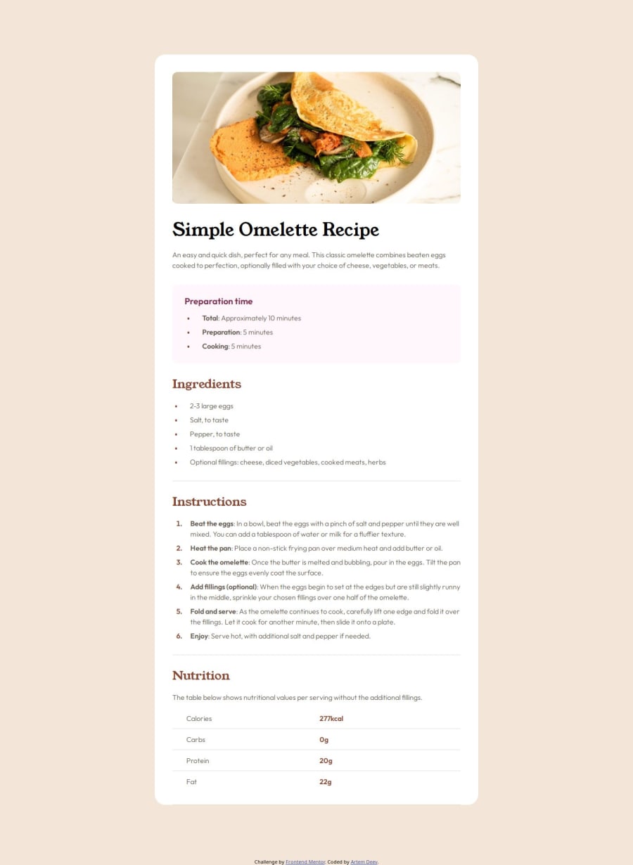
Recipe page solution using HTML/CSS and Sass preprocessor
Design comparison
Solution retrospective
I used Pixelay extension for Figma this time, and it really helped me to see the difference between the design and my code. I'm always trying to make my html code pixel perfect.
I also used Flexbox and Grid to position the elements.
What challenges did you encounter, and how did you overcome them?Using Pixelay helped me identify some mistakes I did when making the code.
What specific areas of your project would you like help with?I still couldn't get the font the exact way as in design. Although I read figma instructions and I used font variable, it still slightly differs from the design (its weight, isusally). If someone can give me an advice on that, I'll very much appreciate that.
Community feedback
- @gabgonsan712Posted 10 months ago
Does the solution include semantic HTML? = Yes Is it accessible, and what improvements could be made? = The page is accesible, maybe you could add some transitions, or hovers on the table to make it more interactive. Does the layout look good on a range of screen sizes? =Yes mainly, but at the media querie for the width of 575px, the image stop adapting, and just stretch over the x axis. Is the code well-structured, readable, and reusable? = Yes it is structured and readable, but no really reusable, it could be more reusable if instead of using sass, uses scss, so can make mixins and variable, in my opinion will be better, and using flexbox could also avoid a lot of code and classes. Also with nesting in scss could avoid using a lot of classes. Does the solution differ considerably from the design? = No, very similar.
Marked as helpful0
Please log in to post a comment
Log in with GitHubJoin our Discord community
Join thousands of Frontend Mentor community members taking the challenges, sharing resources, helping each other, and chatting about all things front-end!
Join our Discord
