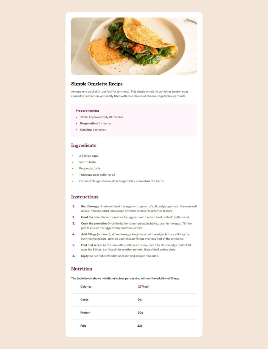
Design comparison
Solution retrospective
I'm proud of how close to the design I managed to get this implementation of this project to look.
What challenges did you encounter, and how did you overcome them?Two main challenges came from the header image, which I wasn't able to manage to fit 100% of the width on mobile view without the text below being affected, so I decided to leave the image as is on desktop view. The other issue came from not being able to use the styles I wanted within the table of the nutrition section. I ended up creating this section with a table and implementing the styling how I wanted it to be.
What specific areas of your project would you like help with?Any ideas about how to implement the image on mobile as full width outside of the container but within the container on desktop would be valuable. Also, how to add styling to HTML tables so that I can create dividing lines between table rows, as I wasn't able to figure this out or find a suitable solution.
Community feedback
- @yas-avocadPosted about 1 year ago
Hey! Looks good :)
I also tried to use the HTML tables, but couldn't control it the way that I wanted to, so I also did what you did of using multiple
<div>elements.1
Please log in to post a comment
Log in with GitHubJoin our Discord community
Join thousands of Frontend Mentor community members taking the challenges, sharing resources, helping each other, and chatting about all things front-end!
Join our Discord
