Design comparison
SolutionDesign
Community feedback
- @yannanclsPosted 3 months ago
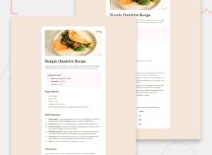
The h1, h2, and h3 tags' font sizes could have been larger. Examining the image of the designed result, I believe the <li> inside the <ul> are brown. The padding between the image and h1 may be reduced, and the appearance of the table at the end can be improved by making it centered or justifying it. Finally, decide if you want to name classes in Pascal, Camel case, or another format. Overall, it is responsive, you did a wonderful job!
0
Please log in to post a comment
Log in with GitHubJoin our Discord community
Join thousands of Frontend Mentor community members taking the challenges, sharing resources, helping each other, and chatting about all things front-end!
Join our Discord
