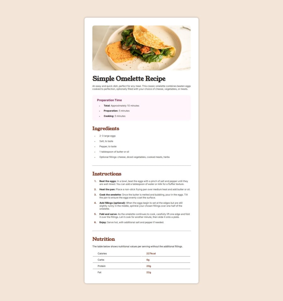
Design comparison
Solution retrospective
I've learned about measurement units, Responsive designs and organizing everything into parts and makes me know a lot about how to visualize everything in head before writing it down I'm now getting used to resonsive design concepts and might use this better
What challenges did you encounter, and how did you overcome them?This project is quite challenge because it has a lot of stuffs in the page. At when i was so confused i have to redo things or start over everything again because my brain can't process (i was starting over for 3 times) But when i tried to organize codes and using comments to saperate everything into parts and it became easier and easier to look up.
What specific areas of your project would you like help with?the final version has a bit issue. when you open in mobile viewport the container of texts is slightly move to the right and i still don't know why because i tried so hard to align stuff and symetrical things. if you can point out my problem it would be great!
Community feedback
- @ARUNKUMAR2906Posted 10 months ago
its a great job my friend.
just one thing. don't repeat instructions on CSS. make a class for styles for you can make a class about the text if you look card-title and card-para they have almost the same
0
Please log in to post a comment
Log in with GitHubJoin our Discord community
Join thousands of Frontend Mentor community members taking the challenges, sharing resources, helping each other, and chatting about all things front-end!
Join our Discord
