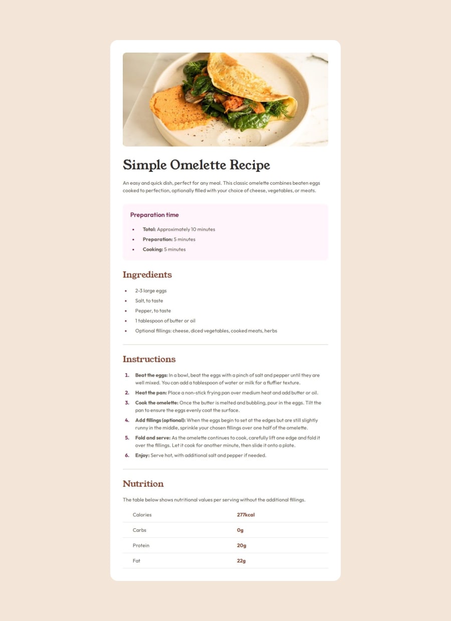
Design comparison
Solution retrospective
Achieving a clean and responsive design while keeping the code organized and maintainable. The use of semantic HTML also made the project more accessible, which was a priority for me.
What I would do differently next time: I would spend more time planning the layout structure and breakpoints to streamline the development process, as well as improve the reusable components.
What challenges did you encounter, and how did you overcome them?One key challenge was managing spacing and alignment across different screen sizes. I overcame this by refining the CSS with a mobile-first approach, focusing on Flexbox and Grid properties to achieve a consistent look.
What specific areas of your project would you like help with?I’d appreciate feedback on optimizing the CSS for scalability and best practices on responsive design—especially on handling complex layouts more efficiently.
Community feedback
Please log in to post a comment
Log in with GitHubJoin our Discord community
Join thousands of Frontend Mentor community members taking the challenges, sharing resources, helping each other, and chatting about all things front-end!
Join our Discord
