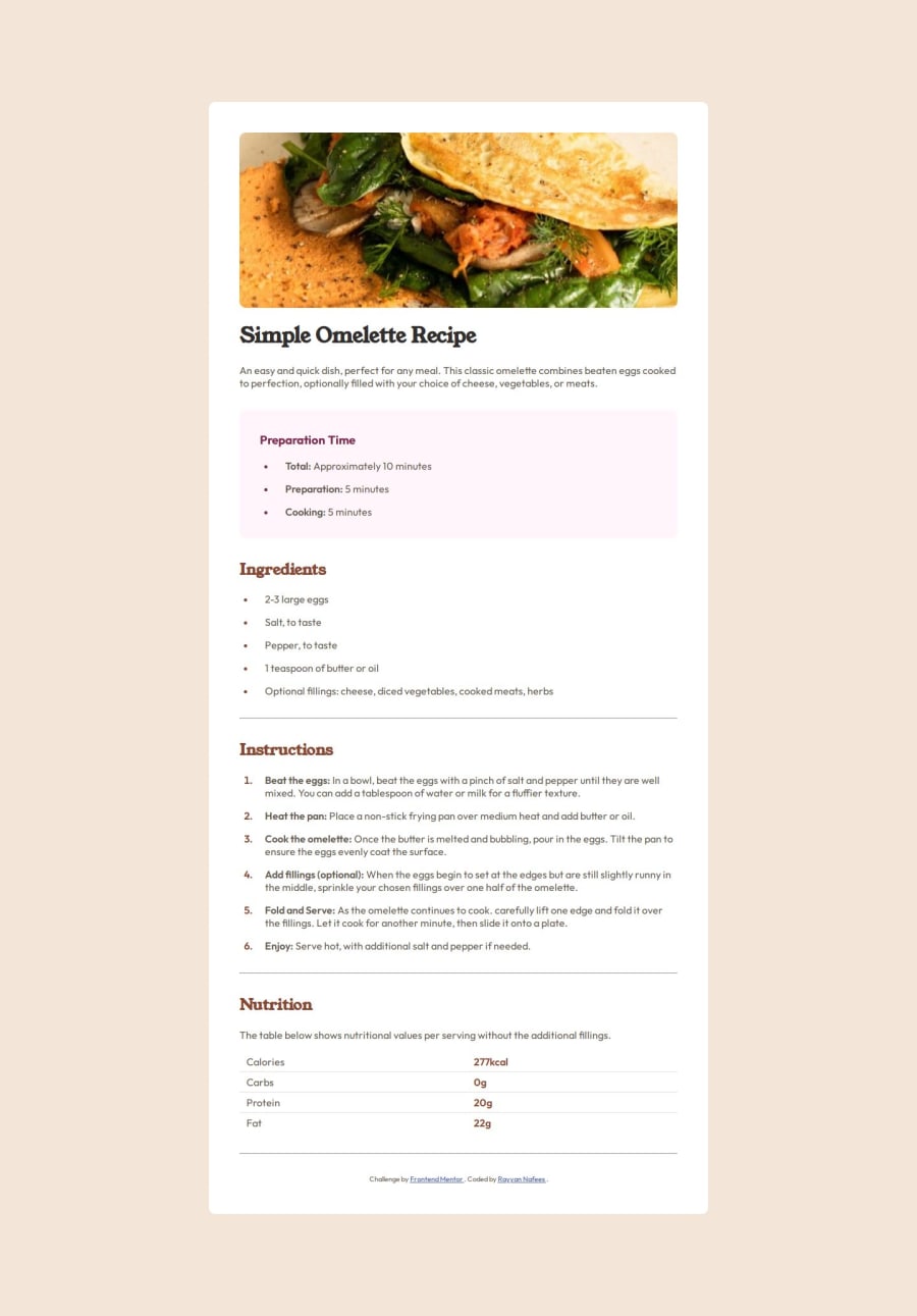
Design comparison
Solution retrospective
In this project i was proud of using vanilla html and CSS (Since ti was too basic of a project) to complete it without the sue of any external libraries / frameworks
Also the fact that I instinctively first created a theme.css file with variables & default styles and then separated my main.css file for styling each element
The overall neatness of my CSS file by utilising CSS nesting was also something to be happy about in the end
What challenges did you encounter, and how did you overcome them?Image Aspect Ratio
I first encountered the challenge of guessing the aspect ratio of the image at the top... Used the new in-built Windows Screen Ruler inside Microsoft PowerToys app to get that
Text padding
Then guessing the padding of each element, using a wild guess of 1rem worked
List Markers
Then I encountered on how to add color to the list markers, thanks to css-tricks i was able to learn about the li::marker pseudo element
Responsiveness
My bad for not taking the mobile-first approach since the start, I then had to put my head around using media queries from MDN docs
What specific areas of your project would you like help with?I'd like to have help in.. using CSS variables inside media queries, could't get that working
And also on what should be the right place to put the ending Credits text at the bottom most
Community feedback
Please log in to post a comment
Log in with GitHubJoin our Discord community
Join thousands of Frontend Mentor community members taking the challenges, sharing resources, helping each other, and chatting about all things front-end!
Join our Discord
