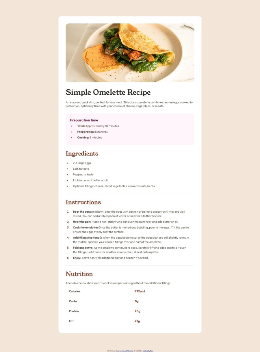
Design comparison
Solution retrospective
I'm proud that I managed to code a slightly larger project while keeping my code relatively clean.
What challenges did you encounter, and how did you overcome them?It took me some time to figure out how to make only part of the text in the lists bold. I used <strong> in HTML to do it.
My solution still differs a bit from the original design.
On mobile, unordered list items that span multiple columns should be vertically centered. But I haven't found a way to do that yet.
The "Nutrition" table seems to be made differently, too. I can't really remove the last bottom border and there's also a small gap between the table data borders.
If anyone has suggestions on how to fix these issues, I'd really appreciate the help!
Join our Discord community
Join thousands of Frontend Mentor community members taking the challenges, sharing resources, helping each other, and chatting about all things front-end!
Join our Discord
