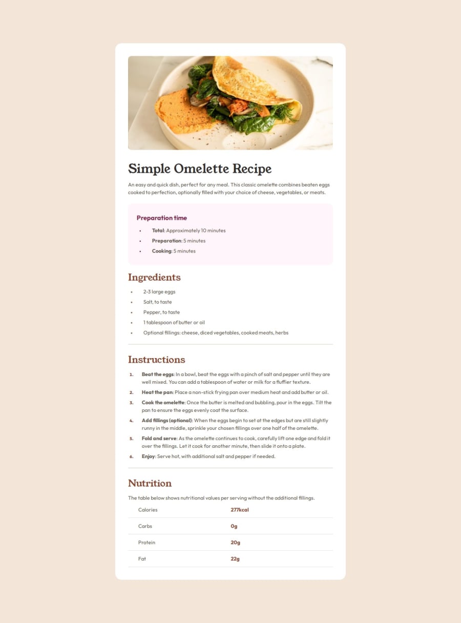
Design comparison
Solution retrospective
Had some trouble copying the table. It doesn't exactly look the same but its good. Also had to do some searches editting the bullets and their margin/padding on every list.
What specific areas of your project would you like help with?Hoping for some feedback about the cleanliness of my css.
Community feedback
- @NeoScripterPosted 6 months ago
Hey, Alingggg! I checked your solution and here is my feedback: Overall, it looks good and according to the design file, however, I noticed that the mobile version is not implemented in your solution. You might wanna use media queries to change your layout for mobile version or, better yet, create a mobile version first and then change its layout for desktop screens. Other than that, good job!
Marked as helpful0@AlinggggPosted 6 months ago@NeoScripter
Thanks for the feedback! But if I may ask, what can be included in the media query? I thought having min/max width would already fix it, and it looked good on mobile when I was testing it.
0@NeoScripterPosted 6 months ago@Alingggg You can include any element properties in a media query. You can reset an element's properties entirely based on the screen width. Your solution does look okay on a mobile screen, but in the design file, it should take all the space of the screen. I remember because I did this challenge several months ago. If you're practicing for a future job as a front-end dev, it's very important that your layout completely correspond to the design file. Hence the feedback.
If you wanna know to to properly use media queries, here is a good Youtube video: https://www.youtube.com/watch?v=2rlWBZ17Wes&t=9s.
Marked as helpful0
Please log in to post a comment
Log in with GitHubJoin our Discord community
Join thousands of Frontend Mentor community members taking the challenges, sharing resources, helping each other, and chatting about all things front-end!
Join our Discord
