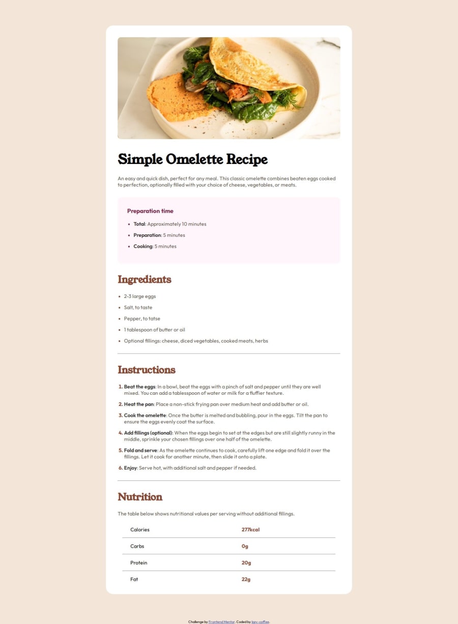
Design comparison
SolutionDesign
Solution retrospective
What are you most proud of, and what would you do differently next time?
I'm happy the final solution came out really well and I was able to put appropriate spacing between each element
What challenges did you encounter, and how did you overcome them?I encountered a challenge adding the spacing between the bullet points and the text after it . I also had a bit of trouble customizing the bullet points but Google helped me with that
What specific areas of your project would you like help with?I'd like some help or pointers about how to space bullet points and their text
Please log in to post a comment
Log in with GitHubCommunity feedback
No feedback yet. Be the first to give feedback on Soye Usoroh's solution.
Join our Discord community
Join thousands of Frontend Mentor community members taking the challenges, sharing resources, helping each other, and chatting about all things front-end!
Join our Discord
