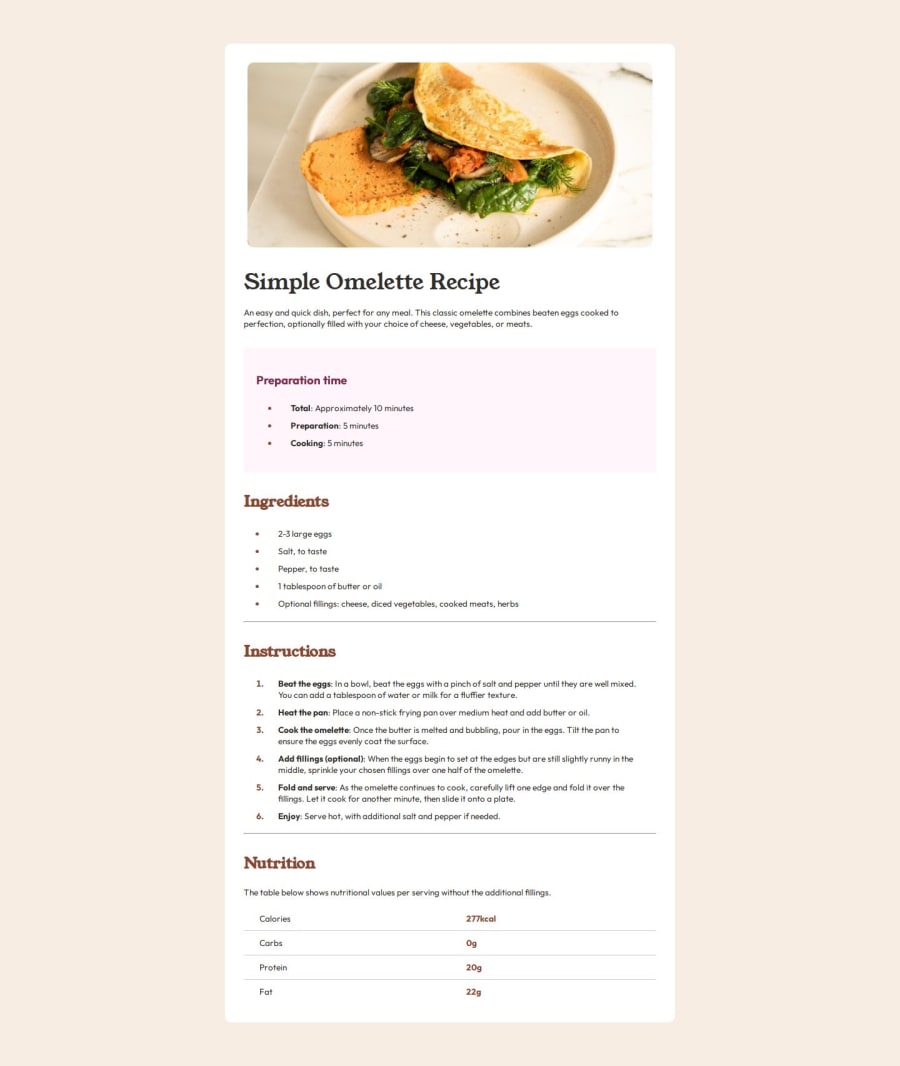
Design comparison
Solution retrospective
Learning more about element positioning and resizing for different screens. I would try to use more css variables and better code segmenting to make my css look nicer.
What challenges did you encounter, and how did you overcome them?Positioning the elements was difficult at times, but flexbox made it much easier.
What specific areas of your project would you like help with?My css feels clunky and redundant, any advice would be appreciated.
Community feedback
- P@MikDra1Posted 7 months ago
Well done, here are some things to review 😊:
-
REM for Units: It's best to use
remfor all units instead ofpx, as this ensures scalability and consistency in spacing and font sizes based on the user's root font size. It helps improve accessibility. -
Semantic HTML: Consider ensuring all elements are wrapped in semantic HTML tags like
<main>,<section>, and<article>to enhance the structure and SEO-friendliness of the page. -
CSS Variables: Implement CSS variables (
--primary-color,--font-size, etc.) for consistent values across the stylesheet. This will allow for easier theme management and tweaking. -
BEM/Convention for Class Naming: Apply a class naming convention like BEM (Block Element Modifier) to make the styles modular and more maintainable. For example, use
.card__titleor.card--highlighted. -
Unitless Line-Height: It's better to set line-height as unitless (e.g.,
line-height: 1.5) to avoid issues with inheritance and allow the spacing to scale appropriately with the font size. -
CSS Reset: Consider adding a full modern CSS reset (like normalize.css or custom resets at the beginning of the stylesheet) to ensure consistent styling across different browsers. Here is a link to one I really like.
-
Clamp() for Responsiveness: Use the
clamp()function for fluid typography and spacing, allowing elements to resize smoothly between a minimum and maximum value based on the viewport size (e.g.,font-size: clamp(1rem, 2vw, 1.5rem)).
Hope you found this comment helpful 💗💗💗
Good job and keep going 😁😊😉
Marked as helpful1 -
- P@StroudyPosted 7 months ago
Awesome job tackling this challenge! You’re doing amazing, and I wanted to share a couple of suggestions that might help refine your approach…
-
Using a
<main>tag inside the<body>of your HTML is a best practice because it clearly identifies the main content of your page. This helps with accessibility and improves how search engines understand your content. -
Your heading elements
<h1><h3><h2>, Heading elements should be in sequentially-descending order (e.g.,<h1>,<h2>,<h3>) to create a clear content structure, improving accessibility and SEO. Skipping levels or using them out of order can confuse screen readers, affect search engine rankings, and make your content harder to understand. -
Using
font-display: swapin your@font-facerule improves performance by showing fallback text until the custom font loads, preventing a blank screen (flash of invisible text). The downside is a brief flash when the font switches, but it’s usually better than waiting for text to appear. -
Developers should avoid using pixels (
px) because they are a fixed size and don't scale well on different devices. Instead, useremorem, which are relative units that adjust based on user settings, making your design more flexible, responsive, and accessible. For more information check out this, Why font-size must NEVER be in pixels or this video by Kevin Powell CSS em and rem explained.- Another great resource for px to rem converter. -
Using a full modern CSS reset is beneficial because it removes default browser styling, creating a consistent starting point for your design across all browsers. It helps avoid unexpected layout issues and makes your styles more predictable, ensuring a uniform appearance on different devices and platforms, check out this site for a Full modern reset
You’re doing fantastic! I hope these tips help you as you continue your coding journey. Stay curious and keep experimenting—every challenge is an opportunity to learn. Have fun, and keep coding with confidence! 🌟
Marked as helpful0 -
Please log in to post a comment
Log in with GitHubJoin our Discord community
Join thousands of Frontend Mentor community members taking the challenges, sharing resources, helping each other, and chatting about all things front-end!
Join our Discord
