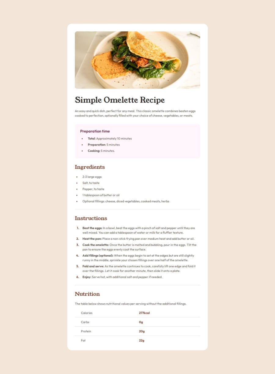
Design comparison
Solution retrospective
I mainly need help with css class naming and bem methodology and table styling. The designs between figma and screenshot vary a lot in padding, margins and gaps. Therefore, at the end of development, very often the code has to be changed or re-written.
Community feedback
- @py-code314Posted 3 months ago
Hello,
Congrats on finishing the project 👏🏼.
I really like the code and I think I can help with a few minor things:
- I noticed that you changed
font-size
to 62.5%. You might wanna read this article before you do that - It's better to also add
max-width: 100%
to <img> in Reset. - It's good to use rem units for
max-width
in.card
instead of px to get better responsiveness - You can use rem units for padding and margin too. I think that makes it more responsive
- What about using 'padding' instead of 'height' in
.recipe__nutrition-table-cell
? - May be there's a better way to organize media queries! Group them together instead of writing at multiple places?
Finally a question for you! You added margin to
.grid
. How did you come up with those values? I'm asking because I couldn't center the card vertically in the <body>All the best. Happy coding🎉
Marked as helpful0@zmora2622Posted 3 months ago@py-code314 I took the values from the figma project and then adjusted using the chrome PerfectPixel plugin and the screenshot. Overall there is a very big discrepancy between the figma design and the screenshot. If you want an identical solution to the comparison, then you have to play with the values yourself.
1@grace-snowPosted 3 months ago@py-code314 great feedback here, keep it up!
The only one I'd question is number 4. It's not always better to use rem for padding and margin. That will really depend on circumstance. Like padding in rem on the white box wouod be bad as it could make the content super narrow when people increase text size, especially on mobile. But margin-top in em on the elements within the recipe would make great sense as you'd always want that to scale with the text size.
What I'm saying is that point is a little more nuanced.
Also, just so you're aware the media queries being throughout the css is a result of the sass compile. That's how sass works - you write the media queries next to each bit you style then it compiles everything at the end. It's a good thing.
1 - I noticed that you changed
- @grace-snowPosted 3 months ago
This looks like a really nice solution, well done!
My one real suggestion is to re-think that aly text on the image. In my opinion it's too verbose, which would unnecessarily add to the amount of information a screen reader would have to process. The goal is to convey the same meaning or purpose. It should briefly describe it and convey that this is meant to look delicious/simple/appetising rather than describe the counter and plate etc...
In reality it won't often be a devs job to write alt text as its a content author job, but I figure its worth mentioning anyway.
The other recommendation is to avoid nesting names the way you are in sass at the moment. The end result is great, but the readability really suffers and it can become very hard to maintain large code bases that nest parts of class names like this. I've actually written a post about my top tips for sass nesting which you may find useful. I always used to write sass the way you are doing now but changed and felt it was beneficial so you might too.
Well done again on the solution.
1@zmora2622Posted 3 months agoI understand that I should keep the nesting for pseudo-classes and pseudo-elements and instead of
.card { &__header { &--highlighted { ... } } }
split into separate blocks
.card { } .card__header { } .card__header--highlighted { }
If I understood your article correctly, the same goes for modifiers (they should be in separate blocks)?
0
Please log in to post a comment
Log in with GitHubJoin our Discord community
Join thousands of Frontend Mentor community members taking the challenges, sharing resources, helping each other, and chatting about all things front-end!
Join our Discord