Submitted over 1 year agoA solution to the Recipe page challenge
Recipe Page- Responsive Mobile Design

@craigwolfe
Solution retrospective
What are you most proud of, and what would you do differently next time?
Learned about new ::marker psuedo element. Not sure I would do much differently.
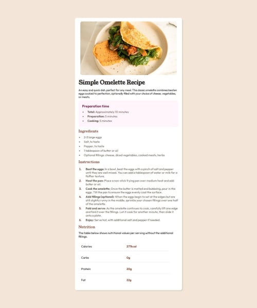
What challenges did you encounter, and how did you overcome them?Getting the recipe image styles correct.
What specific areas of your project would you like help with?Can't think of any right now. I may try to convert this into a React project using a recipe API.
Code
Loading...
Please log in to post a comment
Log in with GitHubCommunity feedback
No feedback yet. Be the first to give feedback on Craig Wolfe's solution.
Join our Discord community
Join thousands of Frontend Mentor community members taking the challenges, sharing resources, helping each other, and chatting about all things front-end!
Join our Discord