Solution retrospective
it was challenging working with ordered and unordered list. Breaking down things into more details and reaching the precision in details. loved it.
What challenges did you encounter, and how did you overcome them?The semantic html was more complicated as i thought. but gradually improvised and improved. it took some time but reached the goal as close as possible.
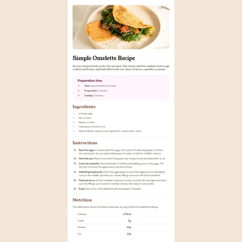
What specific areas of your project would you like help with?In the media query the recipe first information paragraph. I couldn't lined it up as the design shows. tried some tricks but I think i was missing something else.
in mobile design - preparation time section- i couldn't line up the first list dot in the middle of the text. i tried adding some padding but it made it worse.
the last is, the Nutrition section - the calories count- i couldn't lined up those number left side, on top of each other, so i did it on the right side which was easy to do.
Please log in to post a comment
Log in with GitHubCommunity feedback
No feedback yet. Be the first to give feedback on Amit-Mahi's solution.
Join our Discord community
Join thousands of Frontend Mentor community members taking the challenges, sharing resources, helping each other, and chatting about all things front-end!
Join our Discord