

Design comparison

Solution retrospective
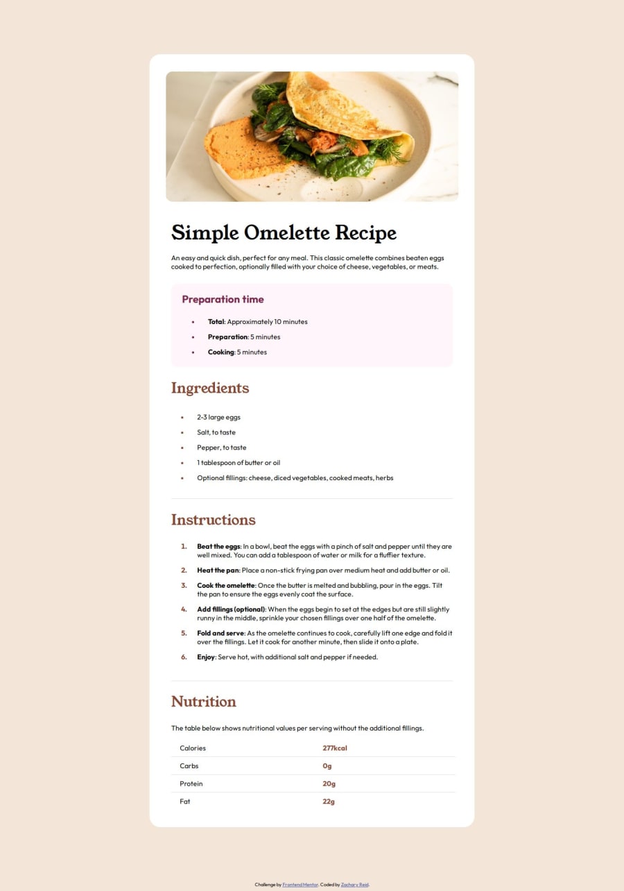
For this project, I was most proud of being able to get it to look as similar to the original as I did. Getting the nutrition table styled properly was definitely a challenge since I have not worked with table much, but once I got it looking good, I was proud of it. I'm not sure if there is anything that I should have done differently or if there is a better practice for any of the elements I included, but if there is, please feel free to let me know!
What challenges did you encounter, and how did you overcome them?The main challenge I encountered with this projects was trying to get the nutrition table styled properly. I was primarily struggling with getting it centered on the page while also having the text aligned to the left.
What specific areas of your project would you like help with?I think the specific areas I need help with are best practices. I'm not very familiar with best practices and am unsure if most of my code meets the standards for best practices.
Community feedback
- @BCEESAY10Posted about 1 month ago
Does the solution include semantic HTML? Yes, it does a little bit because of the section tag used. Hopefully you can make use of main, header and footer too in your subsequent projects.
Is it accessible, and what improvements could be made? Yes, it is accessible. The font used is slightly too large.
Does the layout look good on a range of screen sizes? The layout is not responsive at all. Try learning on @media for responsiveness on small screens.
Is the code well-structured, readable, and reusable? Yes
Does the solution differ considerably from the design? No, well done.
0

Please log in to post a comment
Log in with GitHubJoin our Discord community
Join thousands of Frontend Mentor community members taking the challenges, sharing resources, helping each other, and chatting about all things front-end!
Join our Discord