Solution retrospective
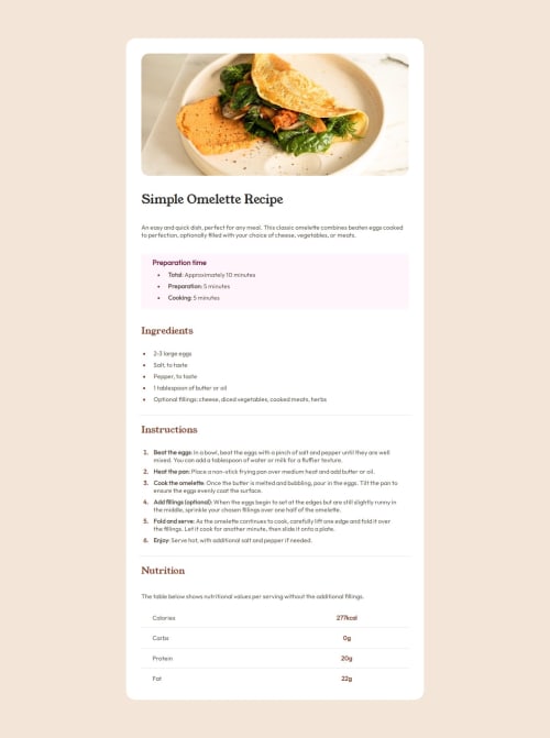
I did a good job assigning classes to the HTML components, and deciding which elements should share a class and which should have their own. This made the styling consistent and efficient. However, I kind of winged it when styling the table at the end of the CSS.
What challenges did you encounter, and how did you overcome them?The last part of the page contains the nutritional values. I asked at the discord and some people advised that I use a table...This was the first time I ever heard of a table in HTML so I had to research it and research how to style it on a whim it was a bit tricky and frustrating but it did the job.
What specific areas of your project would you like help with?I didn't check how the website preforms at different screen widths and on phones. Actually, I never thought of phone functionality when I did the last challenges...I belive I should start looking into how to make my websites accessible to phones but Idk how to start so advise is pretty much appreciated. I also belive that my code isn't super clean and I did a lot of things that could be considered "hacks" and actual solutions. I would appreciate it if someone pointed out the faults and suggested better ways.
Please log in to post a comment
Log in with GitHubCommunity feedback
No feedback yet. Be the first to give feedback on Yahia-kilany's solution.
Join our Discord community
Join thousands of Frontend Mentor community members taking the challenges, sharing resources, helping each other, and chatting about all things front-end!
Join our Discord