Not Found
Not Found
Not Found
Not Found
Not Found
Not Found
Not Found
Not Found
Not Found
Not Found
Not Found
Not Found
Not Found
Not Found
Not Found
Not Found
Not Found
Not Found
Not Found
Not Found

Submitted

Recipe Page

@DylandeBruijn

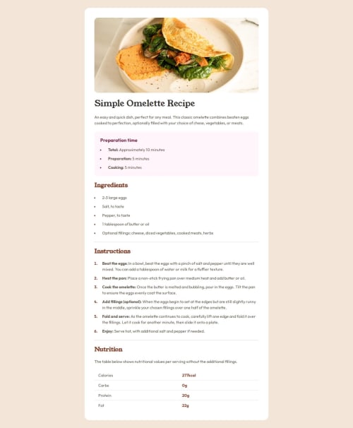
Desktop design screenshot for the Recipe page coding challenge

This is a solution for...

  • HTML
  • CSS
1newbie
View challenge

Design comparison


SolutionDesign

Solution retrospective


What are you most proud of, and what would you do differently next time?

I'm proud getting the solution close to the design specs. Next time I would inspect the design in more detail so I have a better plan for my HTML and CSS structure. It feels a bit bloated at the moment and can probably use a clean up.

What challenges did you encounter, and how did you overcome them?

I ran into problems getting the padding right between mobile and desktop. I wrapped the content in a separate div and wrote some media queries but I'm wondering if there is a more elegant solution.

What specific areas of your project would you like help with?

All general feedback is welcome. If anyone has some tips and tricks for styling lists and tables let me know!

Community feedback

P
josip-h 90

@josip-h

Posted

Hi Dylan!

We meet again. This time, I was assigned to review your solution by the algorithm. Your solution looks good overall, but upon closer inspection, I found a few small differences in padding and gap dimensions compared to the ones specified in the Figma file.

  1. In the desktop version of the page, the gap between the image and the content should be 40px, but yours is 24px.
  2. In the mobile version, the content padding should be 40px on the top and bottom and 32px on the sides, whereas yours is 24px on all sides.
  3. Another small difference is in the list items: their markers (bullets or numbers) should be a bit more indented. In the Figma file, they are 8px from the left border of their parent container.

I can't comment much on your CSS code since I don't know Sass, but I can say that it's much shorter and cleaner than my "vanilla" CSS code. I'll make sure to learn Sass once I solidify my knowledge of "vanilla" CSS.

Marked as helpful

1

@DylandeBruijn

Posted

Hiya @josip-h,

Thank you for your feedback, I appreciate it! I finished this project without using the Figma file as I wanted to save my design tokens, so I tried to recreate it using the screenshots. I'll change the values you mentioned so it's more in line with the design. I like working with SASS and I can recommend it. It still offers a lot of useful features that vanillla CSS doesn't, even though vanilla CSS supports nesting now.

0

Please log in to post a comment

Log in with GitHub
Discord logo

Join our Discord community

Join thousands of Frontend Mentor community members taking the challenges, sharing resources, helping each other, and chatting about all things front-end!

Join our Discord