Recipe Page Project

Solution retrospective
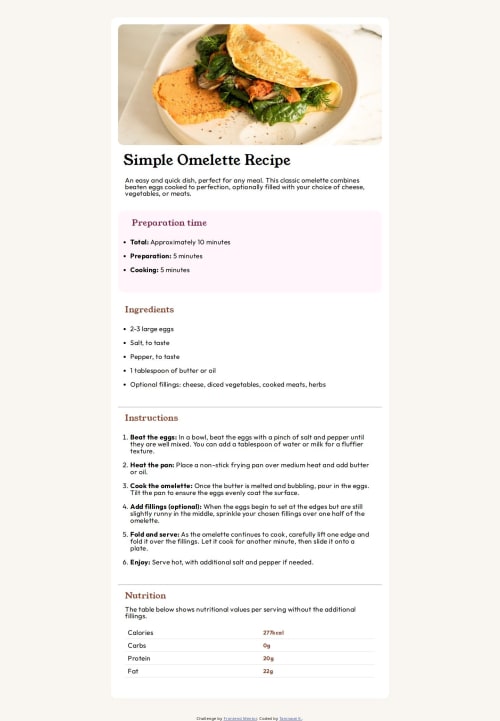
This project does make me realize that I'm still lacking the design skill. When I first looked at the recipe page, I thought of a layout in my head. However, when putting the idea that I had into practice, I struggled so hard to kind of make the card to align center of the web page which I eventually completed it but took quite sometime. What I learned from this project is to practice more on the layout and how to implement it in a better way.
What challenges did you encounter, and how did you overcome them?As I already mentioned, the only challenge that I faced was to think of the layout in a more structured way.
Please log in to post a comment
Log in with GitHubCommunity feedback
No feedback yet. Be the first to give feedback on Iceish96's solution.
Join our Discord community
Join thousands of Frontend Mentor community members taking the challenges, sharing resources, helping each other, and chatting about all things front-end!
Join our Discord