Solution retrospective
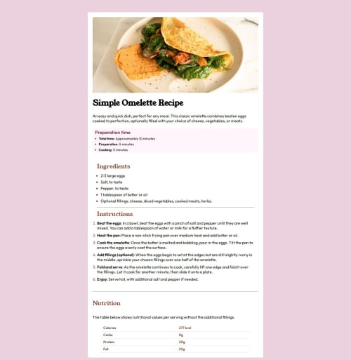
I would do the breaking down of possible styles a little clearer next time. I also know that the image in the responsive view could have been closer to the solution. I'm proud of taking less time in creating the layout and integrating with the repository online via git.
What challenges did you encounter, and how did you overcome them?I had problems with the specific style choices such as the image in responsive view and the bullet points for the recipe ingredients etc. I had to search those online and realised how much more I still have to learn.
What specific areas of your project would you like help with?I feel comfortable with my solution but the thing that still bothers me is the image not taking the full width, I know it has to do with the fact that it is placed within the container and I'm sure there's an easier solution. I will look into it later.
Please log in to post a comment
Log in with GitHubCommunity feedback
No feedback yet. Be the first to give feedback on angwb's solution.
Join our Discord community
Join thousands of Frontend Mentor community members taking the challenges, sharing resources, helping each other, and chatting about all things front-end!
Join our Discord