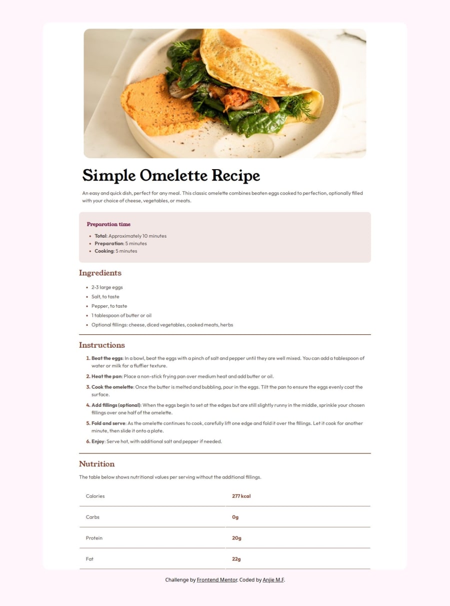
Design comparison
Solution retrospective
I am proud of the table I created in HTML. On the last project, I learned about DRY CSS so I tried to incorporate the principles I learned. In doing so, I deleted about 100-150 lines of code.
What challenges did you encounter, and how did you overcome them?One of the challenges I faced was ensuring consistent styling and layout across different screen sizes. I struggled with centering elements and managing margins and padding, especially in the context of responsive design. However, I achieved the desired layout through experimentation and adjustment of my CSS (and some debugging help with ChatGPT).
What specific areas of your project would you like help with?Redundancy in my code; Responsive Design
Please log in to post a comment
Log in with GitHubCommunity feedback
- @JreyIV
Hi Anjie, You did a great job on this project
I noticed that some padding was a little off. A padding of 2rem would've sufficed and would have wrapped around the whole thing which would have made it closer to the design.
one tip i have for you when it comes to responsiveness is to try to keep media queries to a minimum. Try to have your design be responsive without using too much media query. One way to do that, for example, is by not setting width and height to fixed values. instead, try using max-width and max-height on images and wrappers. I used this for my image
max-width: 100%; max-height: auto;and this for my wrapper/containermax-width: 46rem;in doing so, you don't have to worry about sizing because it will grow and shrink with the screen.in the end, this is all the media query i used:
@media (max-width: 767px) {
  .card-wrapper {
    margin-block: 0;
    min-height: 100vh;
    border-radius: 0;
    padding: 1rem;
    display: flex;
    flex-direction: column;
  }

  .recipe-image {
    margin: -1rem -1rem;
  }

  img {
    width: 100%;
    border-radius: 0;
    padding: 0;
    margin: 0;
  }
}
keeping the media query to a minimum and letting the rest of your code be responsive will make things easier for you in the long run.
as for your redundancies, i think that i have the same problem. one tip i can give you is to make custom variables in the beginning. like this:
:root {
  --ff-accent: "Young Serif", serif;
  --ff-primary: "Outfit", sans-serif;

  --fw-light: 400;
  --fw-normal: 600;
  --fw-bold: 700;

  --fs-normal: 1rem;

  --clr-nutmeg: hsl(14, 45%, 36%);
  --clr-dark-raspberry: hsl(332, 51%, 32%);

  --clr-white: hsl(0, 0%, 100%);
  --clr-rose-white: hsl(330, 100%, 98%);
  --clr-background: hsl(30, 54%, 90%);
  --clr-light-grey: hsl(30, 18%, 87%);
  --clr-wenge-brown: hsl(30, 10%, 34%);
  --clr-dark-charcoal: hsl(24, 5%, 18%);
}
this makes it so that you don't have to do that whole hsl() thing everytime and it makes it easier to change multiple colors, font sizes, font weights, etc later on.
great job and good luck
Marked as helpful
Join our Discord community
Join thousands of Frontend Mentor community members taking the challenges, sharing resources, helping each other, and chatting about all things front-end!
Join our Discord
