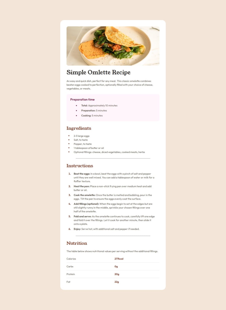


Design comparison

Solution retrospective
I am proud of my semantic html, involving researching the different elements and how they should be used, such as the section tags and also the article tag for the recipe.
I am also proud of my ability to make the design responsive, where it switches from the desktop/mobile view with the use of media queries.
I believe the end result is pretty good and matches the figma design.
What challenges did you encounter, and how did you overcome them?I encountered challenges with the various padding and spacing within elements, such as between the bullet point on the lists and the list item, having to add classes in order to achieve the right spacing as per the figma file.
What specific areas of your project would you like help with?I would like some feedback on both my semantic HTML and also the responsive element of my design. Should I be using pixels for media queries and have I done it in the right way? What other changes should I make to have this as responsive as possible?
Please log in to post a comment
Log in with GitHubCommunity feedback
- P@kaamiik
Hi good job. I have noticed some points I wanna mention:
- On the mobile view add a margin-top, left and right to have a space from the edge of the page.
- This page does not need any
headerand header should not be inside themain. We haveheader,mainandfooterand these are siblings. - You can simply put your text inside
li. There is no need to usespanunless there is a styled text. - On CSS try to use a better CSS reset. Andy Bell's good.
- Never ever use
pxfor font-size. Only userems. https://fedmentor.dev/posts/font-size-px/ - Also for width and heigh also use rems and for spacing you can use
emtoo. - You don't need and you should not use width and height to limit your card. It's not good for the page if your content change. On height you only need
min-height: 100vh;most of the time andmax-width:[...]rem
- @AndresLamar
Hey, everything seems good in terms of HTML semantic and responsiveness of your solution


Join our Discord community
Join thousands of Frontend Mentor community members taking the challenges, sharing resources, helping each other, and chatting about all things front-end!
Join our Discord