Design comparison
SolutionDesign
Please log in to post a comment
Log in with GitHubCommunity feedback
- @MdZaferEqbal
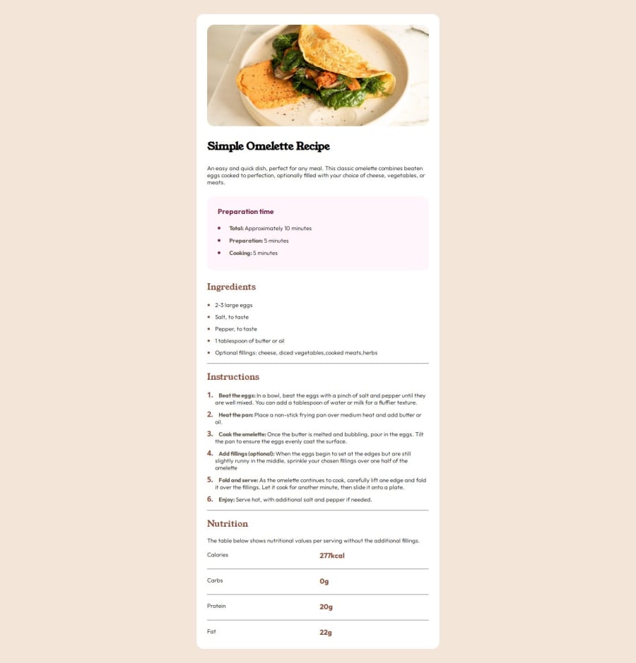
You can even improve it further by adding padding-left to the lists and in table the rows can be center aligned using text-alignment. Apart from these everything look great.
Join our Discord community
Join thousands of Frontend Mentor community members taking the challenges, sharing resources, helping each other, and chatting about all things front-end!
Join our Discord
