Design comparison
SolutionDesign
Please log in to post a comment
Log in with GitHubCommunity feedback
- @Boffdub
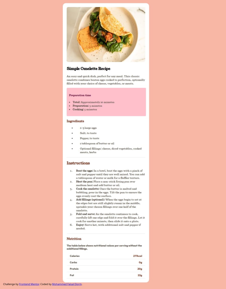
It appears the background color is different than the template given. But if that was intentional, ignore me. Although, the attribution tag should probably be centered at the bottom, regardless.
Other than that, I like it!
Join our Discord community
Join thousands of Frontend Mentor community members taking the challenges, sharing resources, helping each other, and chatting about all things front-end!
Join our Discord
