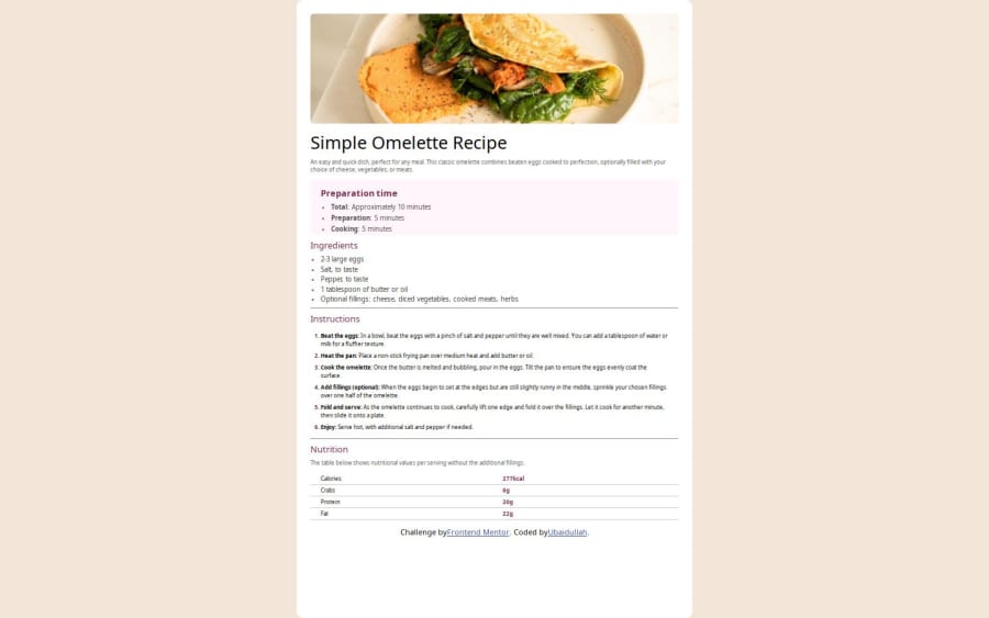


Design comparison

Solution retrospective
It's my first design so it will take some but after I started working on other projects my work speed increased and my code is also clean compared to the previous one.
What challenges did you encounter, and how did you overcome them?My main challenge during this project was making things the same as the given design. But over time I figured it out and now it's easier for me
Please log in to post a comment
Log in with GitHubCommunity feedback
- P@Jan-Dev0
Nice effort on your first design! Here are a few suggestions that might help improve the structure and styling of your project:
1 Improve HTML Structure:
- Use Container Elements: To better organize your content, consider using a <main> element to wrap all your sections. This helps group related content together:
<main> # Your content here </main>- Semantic Elements: Use <section> elements to separate different parts of your content, and wrap the entire content in an <article> element:
<article>
  <header>
   #  Image and header
  </header>
  <section>
    <h1>Simple Omelette Recipe</h1>
    <p>An easy and quick dish...</p>
  </section>
  # Additional sections
</article>
2 Use of HTML Elements:
- IDs vs. Classes: It's generally better to use classes rather than IDs for styling, as classes are more versatile:
<div class="img-box"></div> <div class="item-box"> <div class="text"> <h2>Preparation time</h2> </div> </div>- Semantic Tags: Use <strong> for emphasizing text rather than <b>:
<strong>Total:</strong> Approximately 10 minutes3 CSS Practices:
- Use Flexbox: Flexbox can be very useful for layout and centering content. It makes managing layouts much easier:
body { display: flex; flex-direction: column; align-items: center; justify-content: center; min-height: 100vh; } section { display: flex; flex-direction: column; align-items: center; padding: 20px; }- Avoid height: 100% and width: 100%: These properties may not always be necessary, especially when using Flexbox or Grid. Relative units like rem or em often work better for responsive design:
section {
  max-width: 80%;
  margin: auto;
}
Overall, you're on the right track. Keep experimenting with these suggestions, and you'll continue to improve.

Join our Discord community
Join thousands of Frontend Mentor community members taking the challenges, sharing resources, helping each other, and chatting about all things front-end!
Join our Discord