Design comparison
Solution retrospective
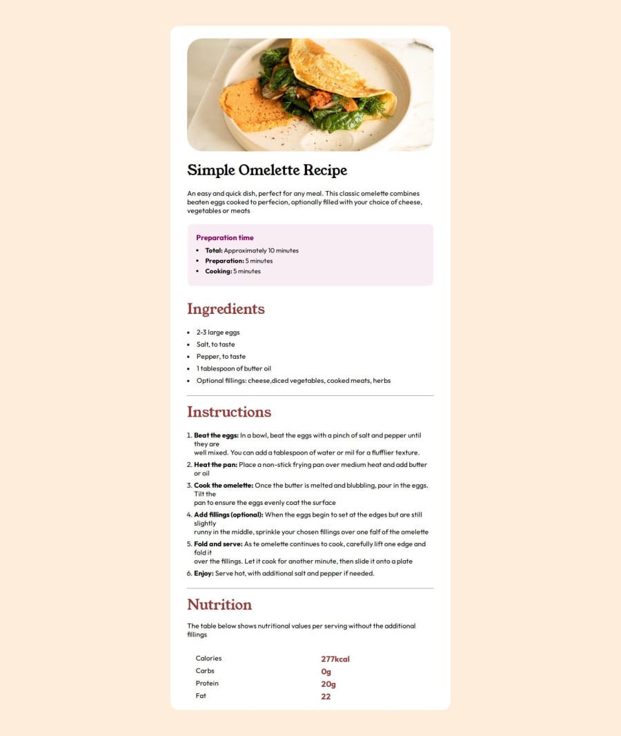
Guys i think that my solution looks pretty close to what is demmanded, but i've had some problems to insert colors in the ordered list (the numbers) and insert horizontal lines in the grid. Hope you guys enjoyed my solution and give it a feedback!
Community feedback
- @george5-starPosted about 1 year ago
Hey, @marlonszm, once again! Congrats on completing the challenge!
Before anything else, I have noticed you have not implemented the suggestion I gave on the previous challenge, so I recommend you actually do so to solidify your understanding.
Now back to these problems:
The Problem: -> Problems inserting colors in the ordered list (the numbers)
<div class="list">
   <li id="eggs">2-3 large eggs</li>
   <li id="salt">Salt, to taste</li>
   <li id="pepper">Pepper, to taste</li>
   <li id="butter">1 tablespoon of butter oil</li>
   <li id="optional">Optional fillings: cheese, diced vegetables, cooked meats, herbs</li>
</div>

// Change the div to ul, like the following:

<ul>
   <li>item 1</li>
</ul>

That's proper semantic html tag to use instead of the div.
The fix:
li::marker {
  color: whatever color you like;
}
The problem: Inserting horizontal lines in the grid
Change the following markup to actually use the table element.

// BEFORE
<div class="nutrition-table">
  <p id="calories-text">Calories</p>
  <h3 id="kcal">277kcal</h3>
  <p id="carbs-text">Carbs</p>
  <h3>0g</h3>
  <p id="protein-text">Protein</p>
  <h3>20g</h3>
  <p id="fat-text">Fat</p>
  <h3>22</h3>
</div>

// AFTER
<table>
  <tr>
    <td>Calories</td>
    <td>277kcal</td>
  </tr>
  <tr>
    <td>Carbs</td>
    <td>0g</td>
  </tr>
  <tr>
     <td>Protein</td>
    <td>20g</td>
  </tr>
  <tr>
    <td>Fat</td>
    <td>22</td>
  </tr>
</table>
Check out the MDN docs on tables if you find them confusing: ---> MDN Docs.
The fix:
tr {
  border-bottom: 1px solid (and your preferred color here)
}
0 - P@jgreen721Posted about 1 year ago
Nice work on this. I did notice you had a fixed width on your recipe card which doesn't always play well with screen responsiveness. Its generally not a bad idea to put a
max-width:attribute on their though to prevent it from getting too big though, somax-width:650pxwould probably work. So far as one of your issues with a borderline on the nutrition portion, I would probably parent each<p>and<h3>up with its ownliordivand give that element a littlepaddingand and aborderBottom. You could probably border bottom the 2 elements long as there is no margin. Other ways certainly but just as a starting off suggestion. Hope some of it it helpful and again nice work!0
Please log in to post a comment
Log in with GitHubJoin our Discord community
Join thousands of Frontend Mentor community members taking the challenges, sharing resources, helping each other, and chatting about all things front-end!
Join our Discord
