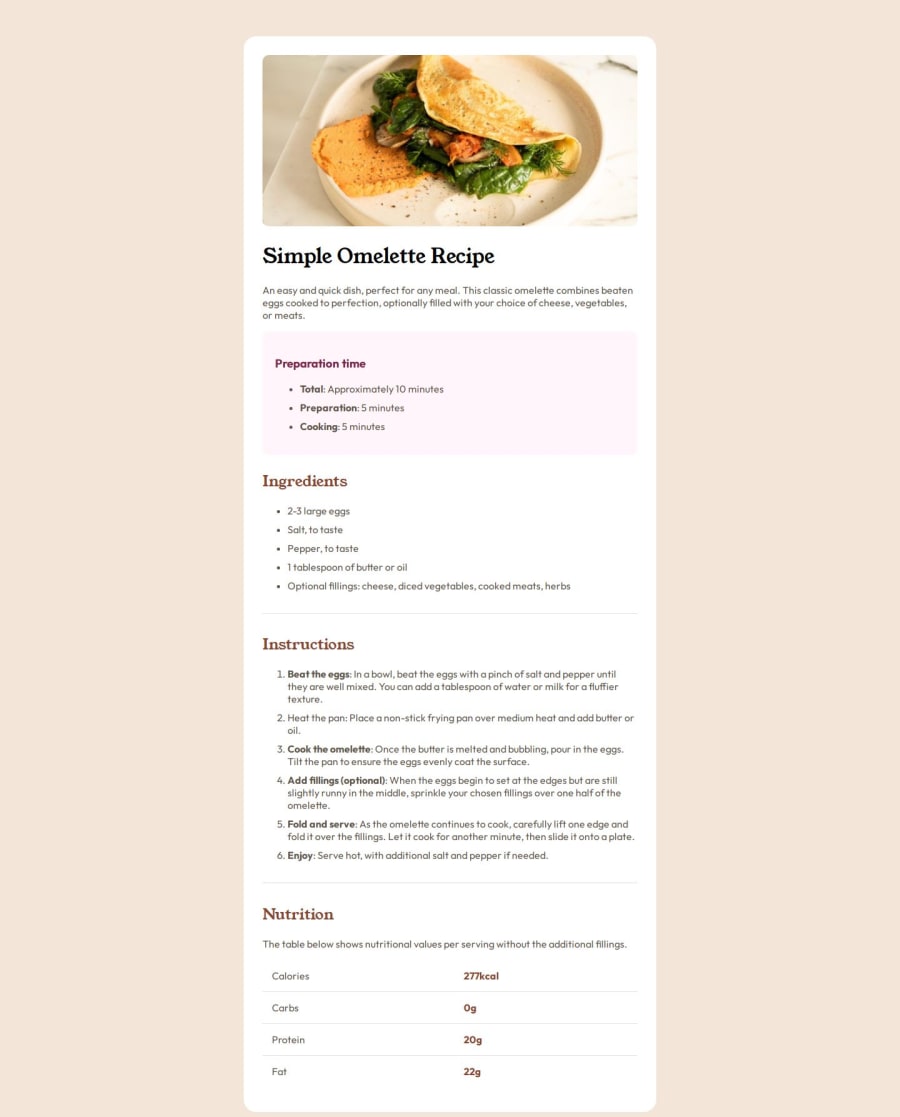


Design comparison
SolutionDesign

Community feedback
- @Isa696Posted 6 months ago
Your desing its almost identical on desktop. Only diference its the margin bottom.
I would recommend checking the mobile design. It will require some media queries to remove the card container and make the image and card width at maximum.
I know this exercise is quite simple, but I think using a CSS reset will ensure total control over margins, paddings, etc.
Also, in my opinion, using relative sizes for paddings, margins, and fonts will result in better responsiveness.
You did a great job!!! 🙌
Marked as helpful0

Please log in to post a comment
Log in with GitHub
Join our Discord community
Join thousands of Frontend Mentor community members taking the challenges, sharing resources, helping each other, and chatting about all things front-end!
Join our Discord