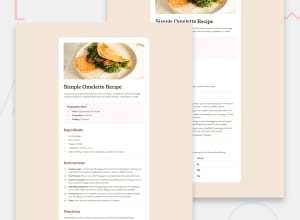
Design comparison
SolutionDesign
Solution retrospective
What are you most proud of, and what would you do differently next time?
I'm proud of work with this framework and did it so good.
What challenges did you encounter, and how did you overcome them?The challenge i see it in this project is how to make the image in mobile screen.
What specific areas of your project would you like help with?I really want to give this advice for every one solve this challenge watch the other project and improve you code also.
Community feedback
- @jboysPosted 2 months ago
Hey Sipan,
I had a look through your code, and it looks good overall! Just a few thoughts on how you could refine it a bit:
Design
- The Young Serif font isn't displayed, despite it being defined in your code
- The top margin is far too large and pushing your content below the fold on Desktop; Mobile shouldn't have any margin.
HTML5 Semantics and accessibility
- Good use of main, footer, and headings (hierarchy)
<article>should wrap the whole recipe and each recipe section should be wrapped in a<section>rather than an<article>- Perhaps use a more descriptive alt text for the omelette image. Something like "Image of a cooked omelette served on a plate" would be more helpful for users with screen readers / limited vision.
Code and best practices
- I noticed you're using tabs for indentation. It's consistent and well-structured, but consider using spaces: it's easier to read — have a look how GitHub renders it. The extra space makes it harder to scan.
- It would be cleaner to move your Tailwind setup/config out of the HTML.
- You’re adding
role="article"androle="main"in a few spots, which is unnecessary since those tags already have those roles by default.
All in all, minor things. Good job!
0
Please log in to post a comment
Log in with GitHubJoin our Discord community
Join thousands of Frontend Mentor community members taking the challenges, sharing resources, helping each other, and chatting about all things front-end!
Join our Discord
