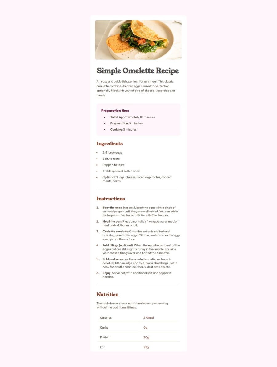
Design comparison
Community feedback
- @mohamedballaPosted about 2 months ago
very good solution , you are almost there. there still some discrepancy with the color of the body background. also the card with is kinda small you can increase it a little bit. again very good solution, keep going.
Marked as helpful1@hazhir00Posted about 2 months ago@mohamedballa Hi mohammed Thank you for your feedback, I just noticed the background color how did I miss that 😅. But I had a problem I hoped you could help with and it's about image responsiveness for the desktop view I gave it 80% width and also a "margin: 1.5em auto" to make it horizontally centered but the "auto" didn't work. You can find it in the CSS file in the media query at the end thanks again ❤️
1@mohamedballaPosted about 2 months ago@hazhir00 for image responsiveness try using "max-width" to control size across different views (mobile, desktop). or "@media" queries to specify the layout for specific view. for centering inside the media queries use flex-box or grid. highly recommend the channel Kevin Powell in YouTube. it helped me a lot. you are doing great, keep going 👍.
Marked as helpful1
Please log in to post a comment
Log in with GitHubJoin our Discord community
Join thousands of Frontend Mentor community members taking the challenges, sharing resources, helping each other, and chatting about all things front-end!
Join our Discord
