Design comparison
Solution retrospective
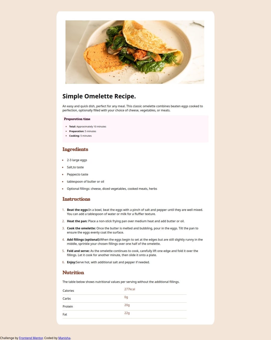
This was the first project i did and i like how it turned out. I would style the table correctly next time.
What challenges did you encounter, and how did you overcome them?Challenges i encountered first are how to align heading and ul items to start on the same line.after so many trial and errors it worked for me. Table bottom borders are also the one i struggled with to center the text and how to adjust the line width and to make it responsive. I would like suggestions on how to make it better.
What specific areas of your project would you like help with?I would like help on table bordering and centering the text and aligning the items.
Community feedback
- P@TheWraithDevPosted 6 months ago
Maybe for the table you can use scope attribute - so screenreaders know that the td information relates to the th information previously
1
Please log in to post a comment
Log in with GitHubJoin our Discord community
Join thousands of Frontend Mentor community members taking the challenges, sharing resources, helping each other, and chatting about all things front-end!
Join our Discord
