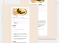
Design comparison
Solution retrospective
I’m proud of successfully creating a responsive design that mirrors a clean and user-friendly interface, ensuring the layout adapts well to various screen sizes. The use of Tailwind CSS and attention to detail for mobile and desktop views, along with structured HTML, resulted in a visually appealing and functional project. Additionally, I was able to implement an efficient layout for the "Omelette Recipe" that is easy to navigate, with clear sections for instructions, ingredients, and nutritional information.
What challenges did you encounter, and how did you overcome them?Responsiveness: One of the main challenges was ensuring the design adapted seamlessly across different screen sizes, from mobile to desktop. It was tricky to balance the layout so that it looked good on all devices without losing the design integrity.
What specific areas of your project would you like help with?mproving Responsiveness on Edge Cases: Although I’ve made the design responsive across standard breakpoints (small, medium, large screens), I’d love feedback on edge cases. How can I ensure the layout remains flawless on unusual screen sizes or older devices
Community feedback
- @JocelyneTeles98Posted about 1 month ago
Hello, @basemmohamed012!
I saw you did a nice job! As you said, responsiveness is also tricky to me. I can share with you some tips I have learned while I was coding for this exercise specifically.
- Which to approach first? What I found on internet is that, when you have to code for many screen sizes, it is a good start by paying attention to mobile sizes. Honestly, I have to learn more about breakpoints, but for this exercise I went for minimum sizes instead maximum (I was doing with maximum sizes before, and honestly that gives you more work to do). So, if you use minimum sizes and think about mobile first, this is going to facilitate a lot. I'll give you my example (again, it may not be the best because I'm learning too but it can help as an example):
/*Mobile styles*/
article {
    background-color: #FFF;
    width: 100%;
}

body {
    line-height: 1.5;
    -webkit-font-smoothing: antialiased;
}

h1 {
    color: #312E2C;
    font-size: 2.5rem;
    margin-bottom: 24px;
}

h2 {
    color: #854632;
    font-size: 1.75rem;
}

h1, h2 {
    font-family: "Young Serif", serif;
    font-weight: 400;
    overflow-wrap: break-word;
}

h3 {
    color: #7A284E;
    font-family: "Outfit", sans-serif;
    font-size: 1.25rem;
    font-weight: 600;
    margin-bottom: 16px;
    overflow-wrap: break-word;
}

img {
    display: block;
    max-width: 100%;
}

.text-placement {
    display: flex;
    flex-direction: column;
    gap: 32px;
    margin-top: 40px;
    padding: 0px 32px;
}

.preparation-time {
    background-color: #FFF7FB;
    border-radius: 12px;
    padding: 24px;
}

.quantity {
    color: #854632;
    font-weight: 700;
}

li, p, td {
    color: #5F564D;
    font-family: "Outfit", sans-serif;
    font-size: 1rem;
    font-weight: 400;
    overflow-wrap: break-word;
}

li {
    padding-left: 16px;
    padding-right: 0;
}

li::marker {
    color: #854632;
    font-weight: 700;
}

table {
    border-collapse: collapse; /*removes the space between cells*/
    margin-top: 24px;
    width: 100%;
}

tr td {
    border-bottom: 1px solid #E3DDD7;
    padding: 12px;
}

tr:last-child td {
    border-bottom: none;
}

ol, ul {
    margin: 0;
    padding: 1.3rem;
}

/*Tablet styles*/
@media screen and (min-width: 600px) {
    article {
        border-radius: 24px;
        padding: 40px;
    }

    body {
        background-color: #F3E5D7;
        display: grid;
        max-height: fit-content;
        min-height: 100vh;
        padding: 128px 48px;
        place-items: center;
    }

    img {
        border-radius: 12px;
    }

    .text-placement {
        padding: 0;
    }
}

/*Desktop styles*/
@media screen and (min-width: 1024px) {
    article {
        max-width: 736px;
    }
}
Notice that I almost filled up almost all the needed styles to the Mobile Size, and then progressively change them while the screen size is growing up. I think this can help you to save time by not repeating much code.
- Breakpoints: Breakpoints are also tricky because nowadays we have the craziest displays sizes. We have now desktop displays that have the size of two standard displays, tablets that now seems to have the screen size of a laptop screen, and so on. Honestly I need to do more research on this, but as you saw on the example of code I sent, the recommendation I found so far is to mark as a minimum size to pass from mobile size to tablet size 600px, and to pass from tablet to desktop size 1024px. I think those sizes are the "standard", but again I need to dive deep because of what I said, the variety of screen sizes we have in the market.
I hope the little I know and that I could share with you helps in something. Keep practicing with enthusiasm that you're going in a good path. Happy coding!
0
Please log in to post a comment
Log in with GitHubJoin our Discord community
Join thousands of Frontend Mentor community members taking the challenges, sharing resources, helping each other, and chatting about all things front-end!
Join our Discord

