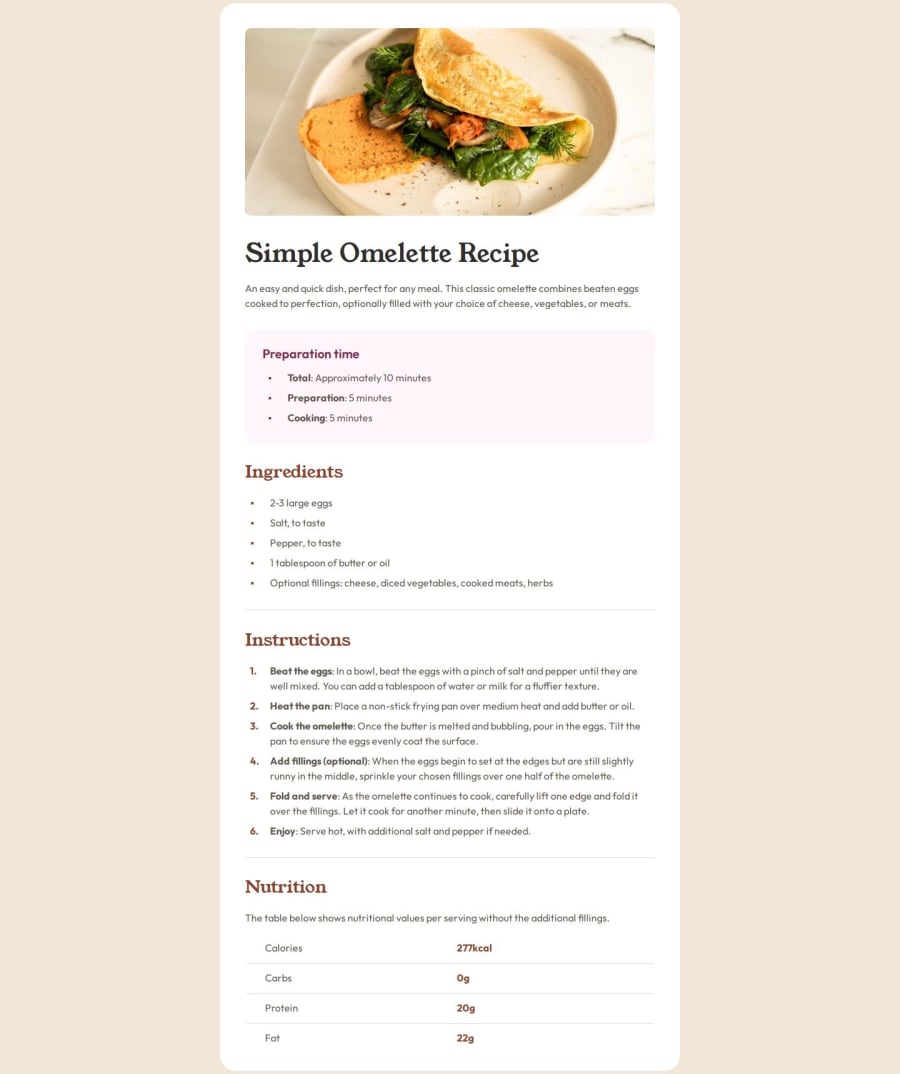
Design comparison
Solution retrospective
I got really caught up making the page as close to the design provided as possible, without the use of the figma file. I enjoy matching the brief and it gives me something to work towards, but it did end up taking me a few extra hours to line everything up. I think I'm still a pixel or two off in some pages, but I'm not sure how much closer I can get.
I decided to use table for the nutritional info, and I know I probably should have used grid or something instead, but I figured I'd stick with it this time around as I haven't had much experience using tables.
Overall, happy with the result but I probably should spend less time on basic challenges and more time time learning new skills!
What specific areas of your project would you like help with?The issue with the generated screenshot not being the same size as the design screenshot really bugs me even though it probably shouldn't. Is there anything I can reasonably do about this?
Community feedback
Please log in to post a comment
Log in with GitHubJoin our Discord community
Join thousands of Frontend Mentor community members taking the challenges, sharing resources, helping each other, and chatting about all things front-end!
Join our Discord
